
After building and testing dashboards using multiple custom dashboard software, these are the 8 platforms that I found work best for growing businesses.
What is a custom dashboard software?
Custom dashboard software pulls data from multiple sources and displays it in one place with charts, tables, and filters that you configure. You're not stuck with someone else's idea of what matters. You build dashboards around your specific KPIs, workflows, and team needs.
The dashboarding software you need comes down to 3 factors:
- How technical your team is: Non-technical teams can use AI-powered tools like Zite to build dashboards with prompts or drag-and-drop interfaces. More technical tools like Metabase and Grafana require SQL knowledge, server setup, or developer involvement.
- Where you want to host it: Cloud platforms like Zite handle hosting and maintenance for you. Tools such as Metabase give you control over where data lives but require technical resources to deploy and maintain.
- What you’re tracking: Marketing dashboards (Databox) track campaigns and ad performance. Ecosystem-specific tools like Power BI work best when your data lives in one vendor's products. Infrastructure dashboards (Grafana) monitor servers and system health. General-purpose builders (Zite and Domo) handle any business metrics.
8 best custom dashboard software: TL;DR
If you just want a quick overview, here’s a side-by-side comparison of the dashboard software we’ll cover:
1. Zite: Best custom dashboard builder overall

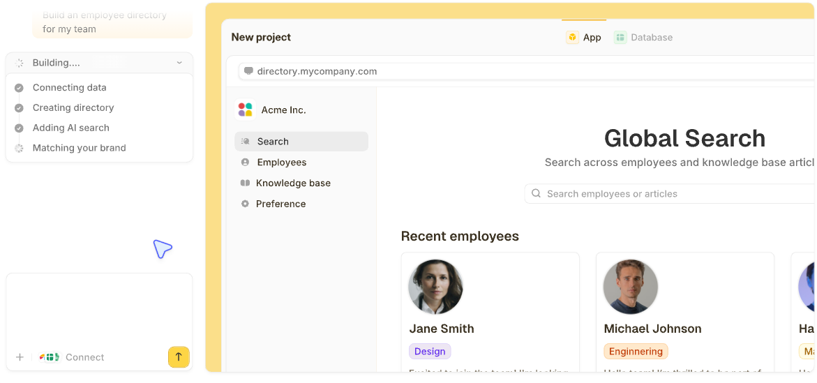
What it does: Zite is an AI-powered platform for building custom internal tools, including dashboards, by describing what you want. Instead of assembling charts, permissions, and data sources by hand, Zite generates a working dashboard with the UI, logic, and access control already in place.
Who it's for: Operations teams, support teams, and SMBs that need production-ready dashboards tied to real workflows and not just read-only analytics.
Zite removes most of the setup work that traditional dashboard tools require. I tested Zite by building a regional sales dashboard. Starting from a short prompt, I achieved a clean layout with filters, charts, and user authentication without needing to configure templates or set up screens.
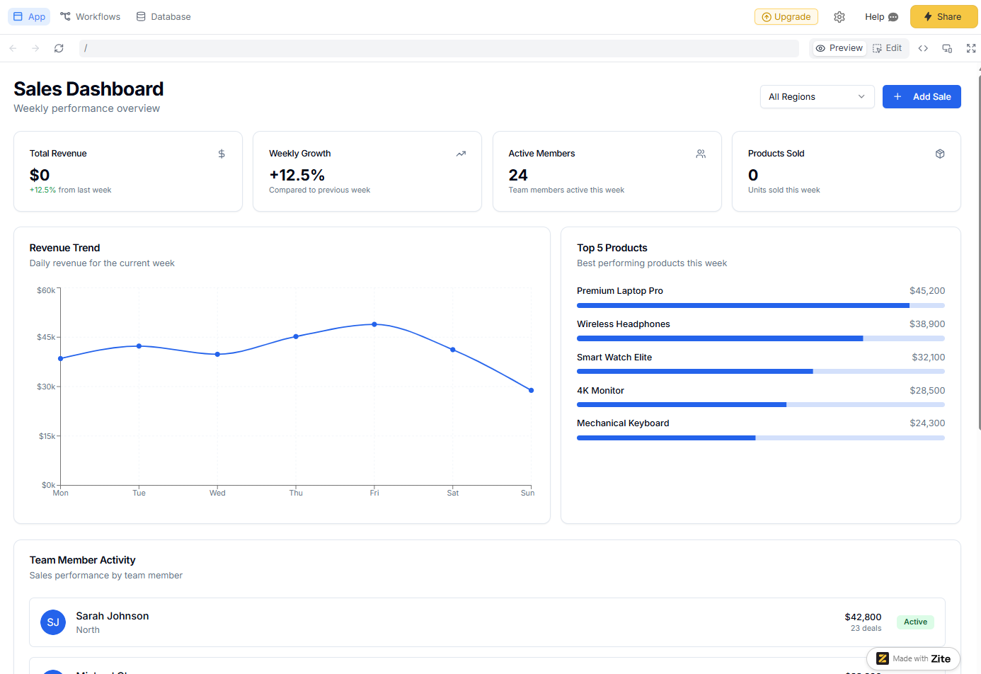
From there, I added a form to update records and used Zite’s built-in database to store and manage the data.
If your data already lives elsewhere, you can connect tools like Airtable or Google Sheets directly. In my testing, the native database was faster to work with, especially when iterating on the dashboard structure.
Making changes is straightforward. You can describe what you want to adjust, use the visual editor to tweak the UI, or edit the generated code directly if you need finer control.
Key features
- Dashboards from prompts: Describe your ideal dashboard, and Zite generates the UI, logic, data schemas, and authentication. You can match the UI to your brand and host the dashboard on your own domain so it feels like a part of your other tools.
- Built-in database: Every Zite app comes with a built-in no-code database that auto-generates schemas and relationships. If your data already lives in Airtable, Google Sheets, or a CRM, you can connect those directly and use Zite purely as the dashboard and app layer.
- Production-grade features: Zite handles user authentication and management, permissions, audit logs, and secure hosting. It supports SSO and is SOC 2 Type 2 compliant, so you can deploy dashboards to real users without additional infrastructure or custom work.
- Unlimited users and apps on all plans: Zite doesn’t charge per seat. You can share tools broadly without worrying about user-based pricing blowing your budget.
Pros
- Fast to build and deploy production-ready dashboards.
- Dashboards support forms, filters, and workflows.
- It’s highly flexible, and you’re not bound to rigid templates.
- An all-in-one platform that combines a form builder, database, automations, and dashboards in one.
Cons
- Not suitable for heavy offline data modeling or complex SQL-based analysis.
- Doesn’t support code export. Zite hosts your apps for you.
Pricing
Zite supports unlimited users and apps on all plans, even free. The free plan includes 50 credits per month, which is enough to build a complete dashboard and make several rounds of changes. Paid plans start at $19/month total (not per user) for 100 credits. Zite consumes credits when you build or modify parts of an app.
Bottom line
Choose Zite if you want an easy way to build and deploy custom dashboards on top of multiple data sources.
2. Looker Studio: Best for Google ecosystem users
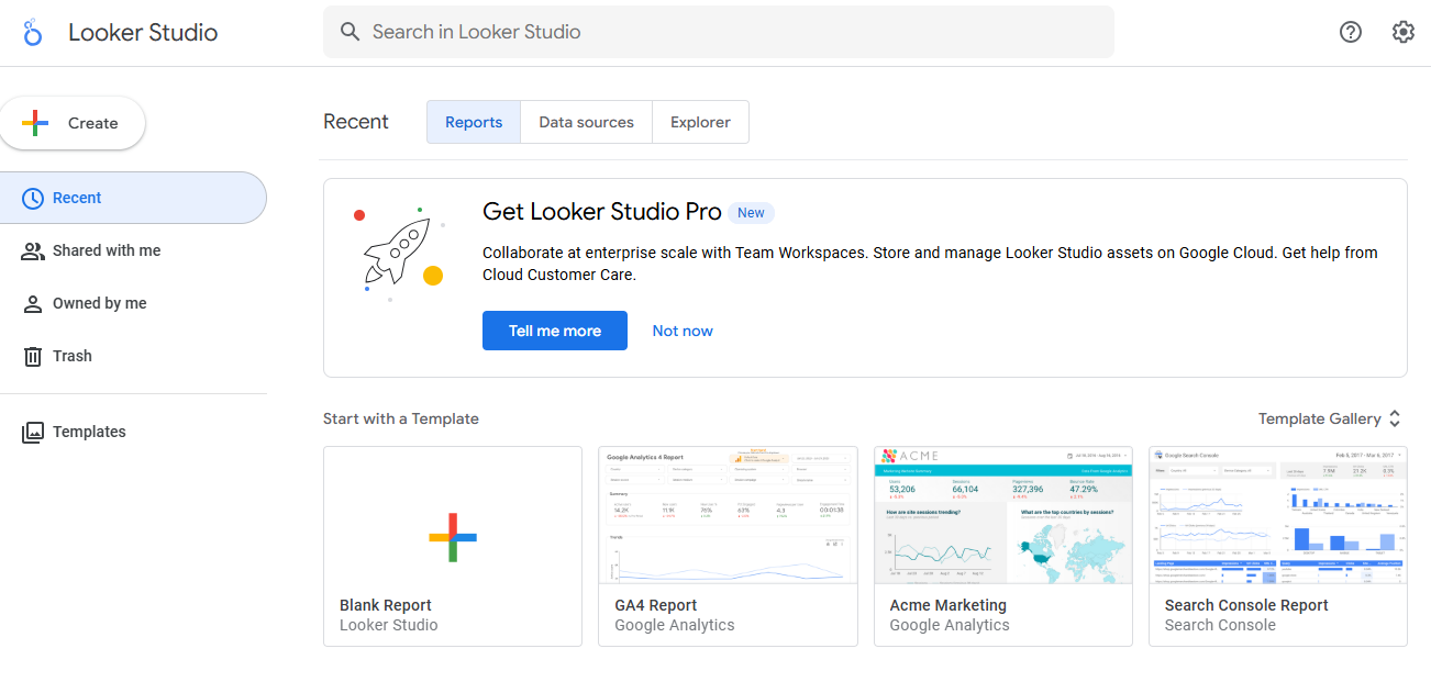
What it does: Looker Studio is Google's free dashboard and reporting tool that connects to multiple data sources (such as Sheets, YouTube, and Google Ads) and creates visual reports with charts, tables, and filters.
Who it's for: Marketing teams, agencies, and small businesses that need shareable dashboards without budget constraints and already use Google products.
Looker Studio excels at creating read-only dashboards for reporting and visualization. I tested it by building a marketing performance dashboard that pulled data from Google Analytics, Google Ads, and a Google Sheets budget tracker.
The interface uses drag-and-drop chart building. You connect a data source, drop charts onto a canvas, and configure filters and date ranges.
Key features
- Native Google integrations: Connects directly to Google Analytics, Google Ads, Google Sheets, BigQuery, and YouTube Analytics without third-party tools.
- Third-party connectors: Supports hundreds of data sources, including Facebook Ads, MySQL, PostgreSQL, and Salesforce, through built-in and community connectors.
- Real-time collaboration: Multiple users can edit the same dashboard simultaneously, similar to Google Docs.
Pros
- Direct integration with Google's ecosystem.
- Easy sharing and collaboration features.
- Large library of pre-built templates for common use cases.
Cons
- Dashboards are mostly read-only with basic filters.
- You need external sources for your data.
- Customization options are more limited compared to paid tools like Power BI.
Pricing
Looker Studio is free for most of its features, including importing data, reporting, and sharing. The pro plan is affordable at $9/user/project/month with no seat limits. It adds enterprise features like team workspaces, enhanced support, and improved data refresh rates.
Bottom line
Choose Looker Studio if you need a shareable dashboard for reporting and visualizing the data that lives in Google products. Skip it if you need interactive workflows, data entry, or custom applications beyond read-only reports.
3. Zoho Analytics: Best for Zoho One users
What it does: Zoho Analytics is a cloud-based BI and reporting tool that helps you visualize and analyze data from multiple departments, including sales, marketing, finance, support, and more.
Who it’s for: SMBs that want centralized reporting across tools and functions, especially if they’re already using other Zoho products.
I connected Zoho Analytics to a CRM and finance spreadsheet to build a multi-tab dashboard covering revenue, churn, and support ticket trends. It handled the data smoothly and offered lots of pre-built widgets for fast setup. The drag-and-drop interface is friendly, and there are AI tools to generate charts and ask data questions.
Key features
- Cross-functional dashboards: Combine data from different CRM, finance, HR, and marketing apps into one view.
- AI assistant (Zia): Ask plain-language questions (“What was revenue growth last quarter?”) and get charts or answers instantly.
- Pre-built analytics for Zoho apps: If you use Zoho CRM, Projects, and Books, Zoho Analytics offers hundreds of pre-built reports for those.
Pros
- It integrates natively with Zoho apps but also supports third-party tools like Google Sheets, HubSpot, and Shopify.
- Role-based access control makes it easy to share dashboards with teams while keeping sensitive data restricted.
- You can set up predictive insights without writing code or formulas.
Cons
- Zoho’s formula syntax and some UI placements take a bit of getting used to.
- The setup process might take time if you’re not already in the Zoho ecosystem.
Pricing
Zoho offers a 15-day free trial. Paid plans start at $16/month (billed annually) for 2 users and 0.5 million rows of data.
Bottom line
Zoho Analytics is a solid pick if your team wants a centralized reporting hub and is already using Zoho One (their all-in-one suite).
4. Databox: Best for marketing KPI dashboards
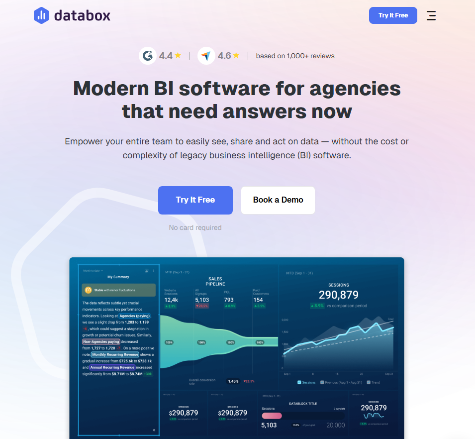
What it does: Databox aggregates metrics from marketing, sales, and analytics tools into unified dashboards. It focuses on tracking KPIs and goals rather than deep data exploration.
Who it's for: Marketing teams and agencies that need to monitor campaign performance across multiple platforms without building custom integrations.
I connected HubSpot, Google Analytics, and LinkedIn Ads to Databox and had a marketing overview dashboard running in 20 minutes. Pre-built templates meant I didn't have to design anything from scratch. I just picked the metrics I wanted to track.
The goal-tracking feature stood out. I set monthly targets for leads and website traffic, and Databox showed progress bars and pace indicators. When metrics dipped below target, I got Slack notifications. This always-on monitoring saves time versus manually checking each platform.
Key features
- 130+ native integrations: Connect HubSpot, Salesforce, Google Analytics, Facebook Ads, Stripe, and more without technical setup.
- Goal tracking: Set targets for any metric and visualize progress. Databox shows whether you're on pace to hit monthly or quarterly goals.
- Automated reports: Schedule snapshots delivered to Slack, email, or mobile. I used daily standups to review pipeline changes.
Pros
- Fastest setup I tested for marketing dashboards.
- It has a mobile app for checking metrics on the go.
Cons
- Limited customization for complex visualizations.
- Gets expensive as you add data sources ($7/additional source).
- Not suited for operational or financial dashboards.
Pricing
Databox has a free plan to try, then you’ll need to book a sales call for the pricing details.
Bottom line
If you spend time switching between marketing tools to check metrics, Databox brings all your campaign and sales data into a single dashboard, which is perfect for monitoring metrics.
5. Metabase: Best for teams with existing databases
What it does: Metabase connects to your existing databases and lets you build dashboards and reports without writing SQL, although SQL support is available for advanced queries.
Who it's for: Technical teams that already have data in databases like PostgreSQL or MySQL and want a self-hosted analytics solution.
You deploy Metabase on your own server or use Metabase Cloud, then connect it to databases like PostgreSQL, MySQL, Snowflake, or BigQuery. From there, you can explore data, build queries, and assemble dashboards.
If you’re not comfortable with SQL, the visual query builder lets you filter data, group results, and create charts through a point-and-click interface. When you need more control, you can switch to SQL mode and write custom queries.
Key features
- Visual query builder: Build reports by selecting tables, filters, and aggregations without writing SQL. This makes it easier for non-technical teammates to explore data.
- SQL mode: Write raw queries when you need joins, CTEs, or complex logic. Results become reusable dashboard components.
- Embedded analytics: Embed Metabase charts and dashboards into other tools using iframes or APIs. This works well when you want to surface analytics inside existing products or internal tools.
Pros
- Free to self-host the open-source version.
- Supports both technical and non-technical users.
- Connects directly to your existing databases, data warehouses, CSV files, or spreadsheets.
Cons
- Requires technical setup for self-hosting.
- Focuses on analytics, not interactive workflows or apps.
Pricing
You can self-host Metabase for free using the open-source version. Metabase Cloud starts at $100/month plus $6 per user, with the first five users included. If you need embedded analytics, you’ll need the Pro plan, which starts at $575/month plus $12 per user.
Bottom line
Choose Metabase if you want an open-source, self-hosted dashboard tool with full control over your data infrastructure. Skip it if you need a plug-and-play setup or don't have technical resources for deployment and maintenance.
6. Domo: Best for enterprise teams consolidating multiple data sources
What it does: Domo connects hundreds of data sources, transforms data without code, and delivers dashboards across large organizations. It's built for enterprises that need centralized data governance.
Who it's for: Large companies with data spread across many systems that need executive dashboards and department-level reporting at scale.
I tested Domo by connecting marketing, sales, and finance datasets. The platform ingested everything into a unified data layer, and I built an executive dashboard showing revenue, pipeline, and campaign ROI on a single screen.
The magic ETL feature handles data transformation without SQL. I dragged tiles to join tables, filter rows, and calculate fields.
Key features
- 1000+ pre-built connectors: Pull data from Salesforce, NetSuite, Google Analytics, databases, and flat files without writing integration code.
- ETL and data transformation: Clean, transform, and combine data from multiple sources using visual data flows or SQL before visualization.
- Custom apps and alerts: Build custom apps on the Domo platform for specific workflows, and set up alerts that trigger when metrics hit certain thresholds.
Pros
- It can replace a stack of tools like ETL tools, data warehouses, and dashboard tools with one integrated platform.
- The built-in data prep reduces dependency on IT or engineers.
- Domo’s UIs for data flows and card building are quite user-friendly with drag-and-drop.
Cons
- You’ll need to make a sales call for pricing details.
- If you just need a few basic dashboards and have data in a couple of sources, Domo is overkill.
Pricing
Pricing is custom, but you can try the platform for free.
Bottom line
Choose Domo if you're an enterprise team that needs to consolidate dozens of data sources with strong governance and real-time updates. Skip it if you're a small team and don’t have the budget.
7. Microsoft Power BI: Best for Microsoft shops
What it does: Power BI creates interactive reports and dashboards from Excel files, databases, and cloud services.
Who it's for: Teams already using Excel, SharePoint, and Teams who want analytics without learning a completely new ecosystem.
I connected Power BI to an Excel workbook and a SharePoint list, building a sales dashboard in under an hour. If you've used Excel, Power BI feels approachable.
I embedded one dashboard directly in a Teams channel, so the sales team saw metrics without leaving their chat app. That integration made adoption easier than standalone BI tools.
Key features
- Integration with the Microsoft stack: Power BI integrates nicely with Excel, Teams, and PowerPoint.
- Natural language Q&A: Type questions like total sales by region and get visualizations. Works well for quick answers, less so for complex analysis.
- Data modeling and DAX: You can create a data model by relating tables like a database and use DAX (Data Analysis Expressions) to create calculated columns.
Pros
- $14/user/month is the cheapest among major BI tools.
- Massive community and training resources.
- It supports row-level security (restricting data by user), deployment pipelines, and on-premises reporting for enterprise use cases.
Cons
- Both creators and viewers need paid licenses for sharing.
- DAX formula language has a learning curve.
Pricing
Power BI Desktop is free for creating reports. To share reports via the cloud, each user (creator or viewer) needs Power BI Pro, which costs $14 per user/month, billed annually. This plan is free if you have Microsoft 365 E5 and Office 365 E5 licenses.
Bottom line
If your company runs on Microsoft, Power BI is the obvious choice. The price is right, and the integrations eliminate friction.
8. Grafana: Best for visualizing infrastructure data
What it does: Grafana visualizes time-series data from monitoring tools like Prometheus, InfluxDB, and Elasticsearch. It's the standard for DevOps dashboards tracking system health.
Who it's for: DevOps teams, site reliability engineers, and IT operations monitoring servers, containers, and applications.
You can connect Grafana to Prometheus and build dashboards that track CPU usage, memory consumption, and request latency across a cluster. The line charts with configurable time windows will show performance patterns from raw metrics.
Key features
- Time-series visualization: Purpose-built for metrics that change over time. Zoom, pan, and annotate graphs to investigate incidents.
- Multi-source queries: Pull data from Prometheus, CloudWatch, Elasticsearch, and 50+ other sources in a single dashboard.
- Alerting: Define thresholds and notification channels. Alerts fire to Slack, PagerDuty, email, or webhooks.
Pros
- Grafana can handle real-time streams for certain sources, which typical BI tools cannot.
- Industry standard for infrastructure monitoring.
- The plugin ecosystem extends to hundreds of data sources.
Cons
- It’s not designed for business KPIs or marketing metrics.
- Setup requires technical knowledge.
Pricing
Grafana is free for personal usage. Paid Grafana plans start from $19/month + usage. It supports 13 months of retention for metrics and 30 days of retention for logs.
Bottom line
Consider Grafana if you're tracking servers, containers, or application performance and have the technical know-how to set it up.
How I tested these dashboard tools
I built at least one dashboard with each tool using sales figures, support tickets, or project timelines.
What I looked for:
- Setup time: How long from signup to a working dashboard with real data?
- Learning curve: Could a non-technical ops person figure this out without training?
- Flexibility: Does the tool handle different data sources and visualization needs?
- Value for ops teams: Does it solve operational problems or just display vanity metrics?
- Integration breadth: How many tools does it connect to out of the box?
- Collaboration: Can teams share, comment, and iterate on dashboards?
- Pricing transparency: Can you predict costs as usage grows?
Which dashboard tool should you choose?
Platforms like Power BI and Domo are built for data analysts who need deep reporting features, while Zite is built for teams who need to build and deploy working apps, including dashboards, fast.
Choose Zite if you:
- Need to build custom internal tools without coding.
- Want dashboards hosted on your own domain with your branding.
- Prefer one platform over juggling multiple point solutions.
Choose Power BI or Domo if you:
- Have analysts who need visualization control.
- Work with large, complex datasets requiring transformation.
- Need enterprise reporting for executives.
Choose Grafana if you:
- Monitor infrastructure, servers, or application performance.
- Have technical resources comfortable with configuration.
Avoid dashboard tools if you:
- Only need task tracking. Project management tools handle this.
- Have no defined KPIs yet (figure those out first).
My final verdict
Zite makes it easy to build and deploy custom dashboards on top of multiple data sources, add interactivity where needed, and control access with conversational AI. You don’t need to stitch together connectors, permissions, hosting, and UI layers.
If your work centers on heavy analytics and data modeling, tools like Power BI or Domo may be a better fit.
Get started with Zite
If you’re curious about how Zite can help you move quickly from data to a custom production-ready dashboard, the best next step is to try it out.
Frequently asked questions
What is the best dashboard tool for operations teams?
The best dashboard tool for operations teams is Zite. You get forms, workflows, databases, and dashboards in one platform, so teams can both view and update data without switching tools.
What’s the difference between a dashboard tool and a BI platform?
Dashboard tools focus on visualizing real-time metrics, while BI platforms like Power BI are designed for deeper data modeling and custom analysis.
Can I build dashboards without knowing SQL?
Yes, you can build dashboards without knowing SQL. Tools like Zite, Zoho Analytics, and Databox are designed for non-technical users. Even BI tools like Power BI and Metabase now offer visual query builders to make setup easier without code.
How much should I budget for dashboard software?
Most custom dashboard software options cost between $10 and $100 per user per month. For example, Metabase’s cloud plans start at $100/month for up to five users, while Zite starts at $19/month for unlimited users (not per-seat pricing).