
A lot of AI dashboard generators stop at mockups that never reach real data, while others handle the data but skip team access entirely.
This guide covers how to turn a plain-language prompt into a working dashboard with live numbers, role-based permissions, and a prompt template that keeps scope tight.
What is an AI dashboard generator?
An AI dashboard generator uses generative models to propose layouts, suggest chart types, and turn plain-language requests into visualizations. With the right process and tools, the proposal becomes a working dashboard faster than building one by hand.
3 main types
The market splits AI dashboard generators into three categories, and each solves a different problem:
- Design-first generators (like Figma Make): produce visual prototypes for stakeholder alignment. They do not connect to live data.
- Analytics-first builders (like Zoho Analytics): combine charting with live data connectors for scheduled reports.
- App-focused generators (like Zite): build dashboards with built-in data logic, permissions, and team access controls.
Picking a category before picking a tool prevents the most common frustration: building a beautiful mockup that will not connect to your actual data.
What you’ll need before starting
Tools and access
- A dashboard tool that fits (which of the 3 did you choose above?).
- A data source, such as a spreadsheet, CSV, database, or analytics warehouse.
- Login credentials for any live data sources that the tool will connect to.
- An account with your chosen AI dashboard product.
Data and permissions
- A sample dataset that reflects the fields in production.
- Clear column names, plus at least one date or time field for trend analysis.
- Permission to access the data and confidence that the sample is representative
Time estimate
- Prototype and layout: 30-90 minutes.
- Connecting your data and testing: 1-3 hours, depending on data quality.
- Polishing, permissions, and alerts: 1-2 hours.
How to build an AI dashboard: Step by step
Step 1: Write one question the dashboard has to answer
One question. That line drives every choice that follows and keeps the dashboard from turning into a graveyard of charts nobody reads.
Strong examples:
- “How did revenue and ad spend perform last quarter by channel?”
- “Which products show rising return rates week over week?”
Teams that start with widgets instead of questions end up with dashboards nobody uses. Write the question first, pin it at the top of your spec, and refer back to it every time you're tempted to add another chart.
Step 2: Lock in 3 to 7 KPIs and the audience
List three to seven KPIs the dashboard needs to track. For each, capture the calculation, the refresh frequency, and the target value if one exists.
Also, capture who will use the dashboard and what decisions they'll make from it. A dashboard for a marketing director tracking channel ROI looks nothing like one built for an ops manager watching order fulfillment.
Example KPI record: Weekly revenue. Calculation: sum of order_amount grouped by week. Frequency: daily refresh. Decision: allocate budget to top-performing channels.
Step 3: Pick your category (prototype, analytics, or app-focused)
The platform you pick shapes how fast you can build, what data it can reach, and who on the team can keep it running. You have three realistic options:
Design-first prototype generators (Figma Make, Mokkup.ai) fit when you need to align stakeholders on layout before investing in data work. They produce polished mockups fast but do not wire to live data.
Analytics-first builders (Zoho Analytics, Displayr, Polymer) are a good fit when scheduled reports and live data connectors matter more than pixel-perfect design. They handle the analytics side well but can feel rigid when the dashboard needs to become part of a larger workflow.
App-focused generators like Zite work well when the dashboard needs to scale across teams, handle sensitive data, or fit into a wider business workflow. Zite generates the dashboard, the database underneath it, and the data logic together from a single prompt, so there is no stitching together separate tools.
For the rest of this guide, we'll walk through Steps 4 through 8 using an app-focused platform as the example, since that's where most teams end up once they outgrow a prototype.
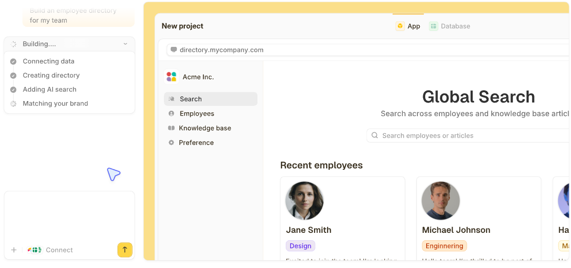
Step 4: Prompt the platform and generate a first draft
With an AI-powered platform like Zite, you describe what the dashboard needs to do and the platform generates the layout, charts, data model, and filter logic. Use the prompt template later in this guide as your brief.
A good prompt covers:
- Primary question: the one sentence from Step 1.
- KPIs and calculations: the three-to-seven list from Step 2.
- Audience and decisions: who uses it and what they do with it.
- Data sources: where the numbers live (spreadsheet, CSV, database).
- Layout and interactions: KPI tiles, trend charts, filters, drill-downs.
Example prompt:
Build a dashboard for an e-commerce director tracking weekly revenue, conversion rate, top product categories, and ad spend by channel. Show a KPI row across the top, a time-series trend for revenue, a stacked bar for channel breakdown, and a table of top SKUs. Include date-range and channel filters. Pull data from our orders Google Sheet.
Zite takes that prompt and generates a working dashboard, including the database tables, page layout, chart types, and filter logic. You get something to review in minutes. Below, I shared a full prompt and template as well.
Step 5: Inspect what the AI built
Generated dashboards need a real review before rollout. This is where app-focused tools either earn trust or lose it.
- Visual workflows: Zite shows the AI-generated logic as a flowchart you can inspect and trace. If a KPI tile pulls from the wrong data source or a filter maps to the wrong field, you can see the entire chain and find where it broke. The visual editor is for inspection and troubleshooting, not manual drag-and-drop building.
- The built-in database: Zite auto-generates tables and fields from your prompt, so there's no separate database to set up. The spreadsheet-like interface shows every table and field the AI created.
Check that relationships make sense (orders linked to customers, products linked to categories) and that AI Fields are enriching records the way you expected.
- Chart and KPI logic: open each KPI tile and confirm the calculation matches what you asked for. Numerical mistakes hide easily in a slick layout.
- Permissions: apps are internal by default, so you control which teammates can use the dashboard.
For client or stakeholder access, you can publish the dashboard to the web and configure login for external users. On the higher-tier plan, audit trail records who edited what, which prevents the "who changed this metric?" arguments that erode trust in a dashboard.
Step 6: Connect your live data and match your brand
Once the structure is right, plug in real data and make the dashboard feel like yours.
- Visual editing: tweak labels, layouts, and chart formatting directly without re-prompting the AI for every small change. Non-technical teammates can update chart titles or rearrange tiles independently.
- Branding kit: enter your company website URL, and Zite automatically pulls your colors, fonts, and styling. The dashboard matches your brand from the first build, which matters when you're sharing KPI views with clients or leadership.
- Native integrations: pull data from Airtable, Google Sheets, Slack, OpenAI, and the Zite database. Workflow actions, such as sending emails or processing Stripe payments, run when users click or submit, so the dashboard does more than display data.
Test filters and cross-filtering before moving on. A dashboard that looks right at a glance can still fall apart the moment a real user changes a date range.
Step 7: Put the draft in front of real users
Hand the dashboard to someone from the intended audience and ask them to complete a task. It should be easy, like "find which channel lost the most revenue last month."
Watch where they get stuck. Fix gaps in labeling, navigation, and data clarity before you expand the user list.
Test edge cases too:
- Missing data and null values.
- Zeros in ratios and percentages.
- Unexpectedly large values that break chart scaling.
- Stale data when the refresh schedule skips.
Edge cases break more dashboards than anyone expects during the design phase.
Step 8: Publish, schedule refreshes, and set alerts
Set access for each viewer. Confirm the refresh cadence for every data source. Document metric definitions so future users can verify how numbers were computed.
If the tool supports conditional logic, wire alerts for anomalies. A spike in return rates could trigger a Slack message to the ops team. A drop below a revenue threshold could send an email to the head of sales. Alerts turn the dashboard from a read-only view into something that pulls attention when it matters.
Dashboard prompt template (copy and use)
Paste this into an AI dashboard generator like Zite when you're ready to generate the dashboard, or keep it as a review checklist once the AI delivers a first draft. Either way, it gets the team aligned on what the dashboard has to answer before anyone argues about colors.
You can fill in every [bracket] with your details, or just share your rough notes and let the AI fill them in.
***
Build a dashboard called [Title] for [audience].
The dashboard needs to answer this one question: [primary question in one sentence].
KPIs to track:
[KPI name] — calculated as [calculation]. Refresh [frequency]. Target: [target, or "none"].
[KPI name] — calculated as [calculation]. Refresh [frequency]. Target: [target, or "none"].
[KPI name] — calculated as [calculation]. Refresh [frequency]. Target: [target, or "none"].
(Add more rows as needed.)
Data sources:
[Source name]: [connection type — CSV / Google Sheet / database / API], sample data at [location], last refreshed [date].
Layout:
Row 1: KPI tiles across the top, one per KPI listed above.
Row 2 left: Time-series trend chart for [which KPI].
Row 2 right: Category comparison chart showing [dimension breakdown].
Row 3: Detail table with search and sort, showing [columns].
Interactions and filters:
Global date-range filter.
Dimension picker for [dimension].
Clicking a KPI tile should filter all other charts on the page.
Acceptance criteria (the dashboard is "done" when all of these are true):
[Primary chart] loads in under 2 seconds for [time window of data].
KPI tiles show correct deltas against the prior period.
Filters apply across all charts consistently.
[Add any other specific criteria].
Security and access:
Viewers: [who can view].
Editors: [who can edit].
Refresh schedule: [how often data refreshes].
External publishing needed: [yes / no]. If yes, the audience is [who].
Common mistakes to avoid
Most dashboard projects fall apart in the same few ways:
- Chart overload: more visuals mean more noise. Every chart on the page should earn its spot by answering part of the question from Step 1.
- Pie charts for complex data: pie charts are hard to compare beyond two slices. Stacked bars or treemaps work better for multi-category breakdowns.
- Skipping user testing: a dashboard that looks right to the builder often confuses the audience. Real-user testing catches labeling and layout issues that self-review misses.
- Undocumented calculations: if two people interpret "monthly active users" differently, the dashboard loses trust fast. Write the calculation next to the KPI.
- Loose access controls: financial or customer data exposed to the wrong audience is a compliance problem. Set permissions before publishing, not after.
Advanced tips
Once the basics are running, a few additions make the dashboard noticeably more useful:
- Anomaly alerts: wire a threshold rule so a spike or dip triggers a notification before anyone notices manually. Even simple rules catch issues faster than waiting for a user to check.
- Pre-computed metrics tables: speed up dashboards that query large raw datasets by refreshing an aggregated table on a schedule. Load times stay predictable as data grows.
- Data lineage: link each KPI back to its source table or query. It builds trust with users who want to verify the math and makes audits easier.
Bottom line: why Zite works for production dashboards
Most AI dashboard tools stop at the mockup. Zite takes a prompt and delivers a working dashboard with the database, logic, permissions, and integrations, all visible and editable.
For teams that need dashboards to run on real data, control who sees what, and stay trustworthy as they scale, that see-and-control setup is the gap between a demo and a tool people actually use.
Unlimited users and apps on every plan, including the free tier. No per-seat pricing, so sharing a dashboard across 10 or 500 people costs the same. Paid plans start at $19/month.
Ready to try Zite?
If you’re building dashboards that need to connect to real data, handle team access, and stay trustworthy as they scale, Zite is worth trying.
Frequently asked questions
What is the best AI dashboard generator?
The best AI dashboard generator depends on priorities. Figma Make is best for rapid prototyping, Zoho Analytics for data-connected reporting, and Zite for production dashboards with access controls and a built-in database.
Can AI generate accurate SQL or metric definitions?
Yes, AI can generate SQL queries and metric definitions, but each should be reviewed and validated against known values before powering a live dashboard.
How do you make AI-generated dashboards trustworthy?
AI-generated dashboards become trustworthy when every metric is documented, each KPI traces back to its source, and users can drill from any chart to the raw rows. Role-based access and a clear refresh schedule also keep the wrong data from the wrong people.
Can an AI dashboard connect to live data?
Yes, an AI dashboard can connect to live data when the tool falls into the analytics-first or app-focused category. Prototype tools like Figma Make produce mockups that need manual integration afterward.
Are AI-generated dashboards secure enough for production use?
Yes, AI-generated dashboards can be secure for production when the platform offers role-based access, data encryption, and clear hosting. Tools built for team use, like Zite, include built-in authentication, role-based permissions, and access controls on every plan, so you can control who sees what without writing security code. SSO and audit logs are available on higher-tier plans when needed.