

I’ve built Airtable dashboards for everything from sales pipelines to content calendars, and they work well up to a point. This guide covers what the limits of Airtable’s dashboards are and what to do when you hit them.
What are Airtable dashboards?
Airtable dashboards are visual summaries of your base data, built using Airtable’s Interface Designer. They let you turn raw records into charts, scorecards, filtered lists, and summary numbers on a single page.
The idea is simple: instead of scanning rows and columns in a grid view, you get a visual overview of the metrics that matter most to your team.
Sales managers use them to track pipeline stages. Project managers use them to monitor task progress. Ops teams use them to spot bottlenecks across workflows.
Airtable offers two ways to build dashboards:
- Interface Designer (Dashboard layout). A drag-and-drop page builder with pre-built elements like charts, number summaries, and filtered lists. This is the primary method Airtable pushes today.
- Extensions (formerly Apps). Add-on chart widgets you can attach directly to a base view. Older method, more limited, but still available on paid plans.
Both options pull data from your existing Airtable bases. No extra setup or data exports needed.
How Airtable dashboards work
Building an Airtable dashboard starts in the Interface Designer. You create a new interface, choose the “Dashboard” layout, and connect it to a table in your base.
From there, you can add elements:
- Number summaries that count, sum, or average records (e.g., total open deals, average response time).
- Charts including bar, line, pie, and donut charts for visualizing distribution and comparisons.
- Filtered lists that show specific record subsets (e.g., overdue tasks, high-priority tickets).
- Pivot tables for grouping and aggregating data across multiple fields (available on paid plans).
- Text blocks for adding headers, context, or instructions.
You can also set permissions per interface, so different team members see different views. An executive dashboard might show high-level KPIs, while an ops dashboard shows granular task details.
What Airtable dashboards are good at
For teams already storing data in Airtable, the dashboard tools handle a few things well:
- Quick setup for operational snapshots. If you need to see current record counts, status breakdowns, or field distributions, you can build a functional dashboard in under an hour.
- No extra tools required. Everything lives inside Airtable, so there’s no data pipeline to configure or third-party tool to pay for.
- Filtered views by role. You can create separate interfaces for different audiences without duplicating data.
For basic reporting on current data, Airtable dashboards get the job done. The problems show up when you need more.
Where Airtable dashboards fall short
Airtable’s dashboard features are well-suited for simple operational snapshots. But business teams often need more from their dashboards, and that’s where the limitations become real.
No trend analysis over time
This is one of the most consistent frustrations with Airtable dashboards. You can see what your data looks like right now, but tracking how it changed over 30, 60, or 90 days is difficult.
There’s no native time-series chart that automatically updates to show historical progression. You’d need to structure your base specifically around time tracking, which most bases aren’t designed for.
Record and plan limits
Airtable's Team plan limits each base to 50,000 records. The Business plan raises the per-base ceiling to 125,000 records at $54/seat/month.
To put that in context, a 50,000-record base can hold a mid-sized company's client list or about two years of order history for a small e-commerce operation. If you're tracking individual transactions, support tickets, or product inventory across locations, you'll hit 50,000 faster than you'd expect and need to decide whether the jump to Business pricing is worth it.
Per-seat pricing for dashboard access
Anyone who needs to edit data in Airtable counts as a paid seat, whether that's $24/seat/month on Team or $54/seat/month on Business.
Read-only viewers are free, but the moment a team member needs to update a record from the dashboard, they become a paid seat. For a 15-person team, that's $360/month on Team or $810/month on Business just for base access.
Can’t join data across bases
Each Airtable base is its own island. Linked records work within a base, but you can’t pull data from two separate bases into a single dashboard view.
If your customer data lives in one base and your project tracking lives in another, there’s no native way to combine them analytically.
Limited customization
Airtable’s community forums are full of requests for basic dashboard features that still aren’t available: resizable elements, grid views on dashboard pages, and more flexible chart formatting. The dashboard layout gives you preset element sizes and limited design control.
Automation logic lives elsewhere
Airtable's dashboard interactions are in Interface Designer, but the workflows that trigger off them are configured in a separate Automations panel. The visual layer and the logic that powers it never sit side by side, so building "click this on the dashboard to do X" interactions means switching contexts between the visual builder and the automation panel.
Airtable dashboard pricing
Airtable dashboards are available across all plans, but with significant tier differences:
All prices above are monthly-billed rates. Annual billing is roughly 17% cheaper.
The real cost driver is seats. Every editor on your team is a paid seat, and the per-user pricing adds up fast as your dashboard audience grows beyond a handful of people.
When Airtable dashboards are enough
Airtable dashboards work well in specific situations:
- Small teams (under 10 editors) where per-seat costs stay manageable.
- Single-base data that doesn’t need to be combined across multiple sources.
- Operational snapshots where you need to see the current status, not historical trends.
- Internal-only use where you don’t need branded, client-facing views.
If your dashboards only need real-time operational summaries and all your data already lives in Airtable, the built-in tools can handle it. Just know that historical reporting and advanced analytics will need workarounds or a separate tool.
When you’ve outgrown Airtable dashboards
For business teams that need more from their dashboards, the limitations above start compounding. You hit the record cap. You need 20 people to access and edit data. You want dashboards that connect to multiple data sources. You want to share branded views with clients.
If you're running into these limits, it's worth looking at how Zite compares to Airtable for building dashboards and apps.
Where Zite beats Airtable for dashboards
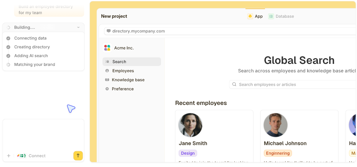
Zite is an AI app builder from the team behind Fillout. Describe the custom app you need in plain language, and Zite generates it for you, including the database, interface, and app logic.
For dashboard use cases, a few things stand out:
- A built-in database that auto-generates the tables and fields your app needs from your description. The interface looks and feels like a spreadsheet, so it's easy for anyone to pick up.
You can see all your data, linked records, and AI-generated fields right from the start without learning database concepts or stitching separate tools together.
- Dashboard generated from a prompt: describe what you want clients or your team to see (pipeline by stage, average deal size, weekly trend lines), and Zite builds the page with the right charts, summary cards, and filtered lists pulled from your data. No Interface Designer learning curve to wrestle with.
- Single Pro plan covers unlimited users. Zite's Pro plan starts at $19/month with unlimited users and apps. A 15-person team pays a total of $19/month, regardless of seat count. On Airtable, the same team pays $360/month on Team or $810/month on Business, depending on which tier matches your needs.
AI credits are limited on lower-tier plans, but visual edits and error fixes never count against your balance. For teams building dashboards that many people need to access and update, the cost difference is significant.
- Permissions and publishing control. Apps start as internal-only by default. You control access through roles and permissions, and you can publish to the web for client-facing dashboards when you’re ready.
This means you can build an internal ops dashboard and a branded client portal from the same data without paying extra.
- Connect to your existing data. Zite natively integrates with Airtable, Google Sheets, Slack, and OpenAI. You can keep Airtable as your data source and use Zite as the app and dashboard layer on top, or move your data into Zite’s built-in database and skip Airtable entirely.
- Branding kit for on-brand dashboards. Input your website URL, and Zite extracts your branding automatically, so generated apps and dashboards match your company’s look from the start. For client-facing dashboards, this saves hours of design work.
Honest limitations of Zite
- Newer platform, so the ecosystem and template library are still growing compared to Airtable’s established marketplace.
- AI credits are limited on free and lower-tier plans.
- No code export. Apps stay hosted on Zite. You can’t download the source code.
- No native mobile app export. Zite builds web apps, not apps for the Apple App Store or Google Play.
Zite vs. Airtable for dashboards: quick comparison
How to get started if you’re switching
If your team has outgrown Airtable dashboards, you don’t need to abandon Airtable entirely:
- Keep your Airtable data where it is. Zite connects to Airtable natively, so you can build dashboards on top of your existing bases.
- Describe the dashboard you need. Tell Zite what metrics, charts, and views you want. The AI generates the app structure, database connections, and interface.
- Inspect the workflow logic. Check the visual workflow view to verify the app does what you expect. Trace the logic step by step.
- Set permissions and publish. Start with internal access for your team, then publish to the web for clients or external stakeholders when ready.
- Migrate data if you want to. If Airtable’s record limits or pricing are the bottleneck, move your data into Zite’s built-in database. The spreadsheet-like interface makes the transition familiar.
Frequently asked questions
Can I build a dashboard in Airtable for free?
Yes, you can build a dashboard in Airtable for free, but with limits. The free plan allows one dashboard with up to 1,000 records per base. For most business use cases, you’ll need at least the Team plan ($24/seat/month) to access extensions, pivot tables, and more than one interface.
Are Airtable dashboards good for client reporting?
Airtable dashboards work for internal teams, but for client-facing reporting, the limitations add up. Portal access starts at $120/month, branding options are minimal, and every client who needs edit access counts as a paid seat. Tools like Zite offer client-facing dashboards with custom branding and no per-seat pricing.
What are the biggest limitations of Airtable dashboards?
The biggest limitations of Airtable dashboards are the lack of trend analysis over time, record caps per base (50,000 on Team, 125,000 on Business), per-seat pricing that becomes expensive as teams grow, and the inability to combine data from multiple bases into a single dashboard view.
Is there a better alternative to Airtable for dashboards?
Yes, several tools offer stronger or more specialized dashboard features than Airtable, depending on whether you need advanced reporting, lower costs, or client-facing views. If you want dashboards with a built-in database, visual workflow logic, no per-seat pricing, and client-facing publishing, Zite handles all of that and connects to your existing Airtable data.