

The best operations teams run a dashboard for every major workflow they manage. Here are 9 operations dashboard template examples teams use in 2026, plus the no-code tools to build your own.
What is an operations dashboard?
An operations dashboard is a single screen that pulls live operational data from across your systems, showing the health of inventory, orders, staff, equipment, or whatever else your team manages day-to-day.
Most operations data lives across systems: ERPs, CRMs, spreadsheets, ticketing tools, warehouse management software, and email. An operations dashboard pulls the right metrics from each into one place, so the team sees what's happening without manually piecing together status updates.
Most operations dashboards have:
- Real-time KPI displays: Numbers and gauges showing your most important operational metrics in their current state
- Trend visualizations: Line charts, bar charts, and heat maps showing how key metrics have changed over time
- Alerts and thresholds: Visual flags when metrics cross critical lines, like inventory below safety stock or response time over target
- Drill-down sections: Tables and detail views so the team can click into any metric for context
- Filters and segments: Controls to view data by team, region, product line, or time period
9 examples of operations dashboard templates
Here's how different teams put these elements together for their workflow.
1. Inventory management dashboard
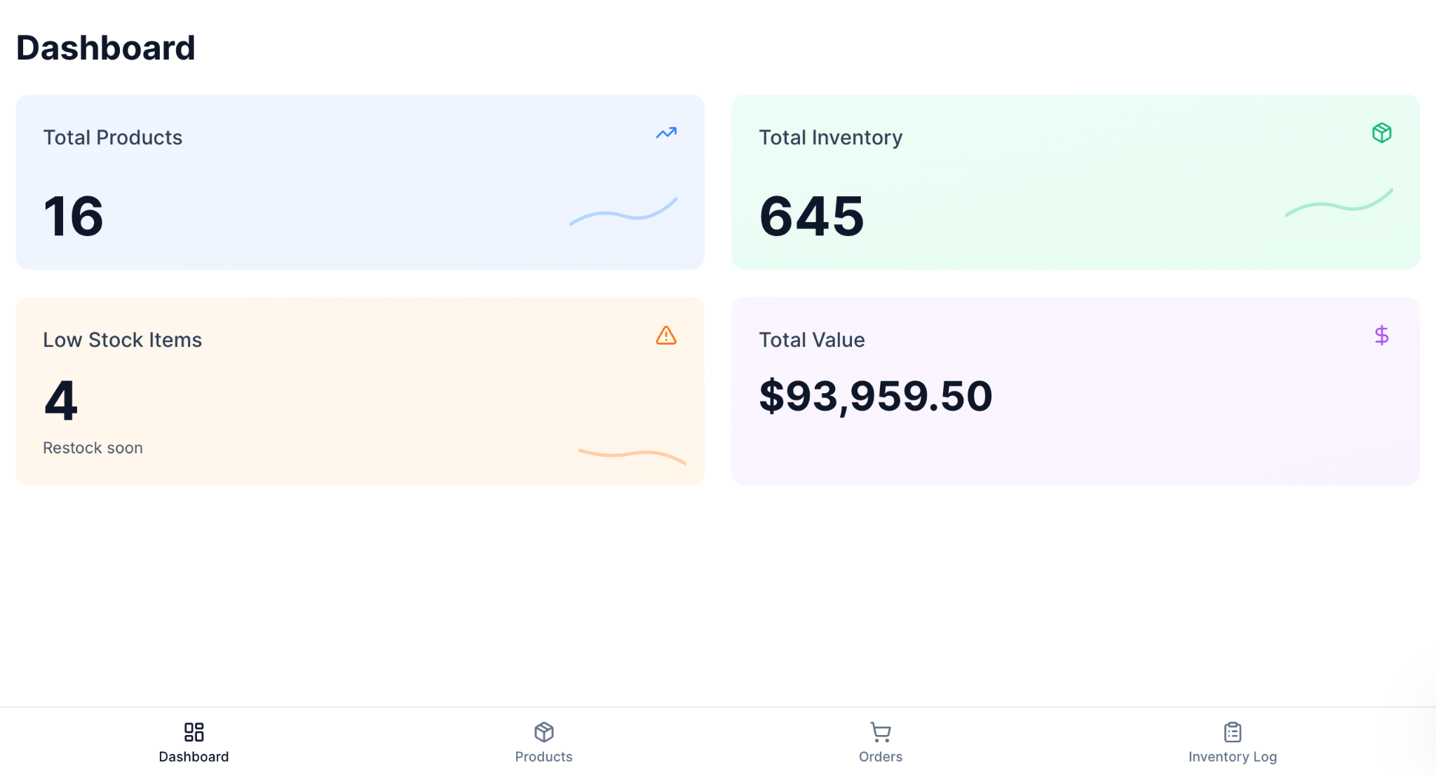
An inventory management dashboard provides operations teams with real-time visibility into stock levels for every product and location. The team sees what's running low, what's overstocked, and what's moving fastest at any moment, without waiting for end-of-week reports.
Zite's Inventory Manager template by Omation is a ready-made starting point you can clone and customize for your own catalog and warehouses.
Key metrics to include:
- Current stock levels by product and warehouse
- Low-stock and out-of-stock alerts
- Inventory turnover rate
- Days of supply remaining
- Slow-moving and dead stock flags
The payoff: Stockouts cost sales, and overstock ties up working capital. A live inventory dashboard catches both before they run unchecked.
Prompt to try in Zite: 'Build an inventory operations dashboard showing current stock levels by product and warehouse, low-stock alerts, turnover rate, days of supply remaining, and slow-moving stock flags. Pull data from our Shopify product catalog and warehouse spreadsheet.'
2. CRM dashboard

A CRM dashboard consolidates customer interactions, account health, and opportunity activity into a single view that sales and account teams can act on. It surfaces who needs follow-up, which accounts are growing, and which deals are going cold.
Zite's CRM template by Automation Helpers is the most-cloned template on the marketplace, with accounts, contacts, opportunities, and activities already configured.
Key metrics to include:
- Active accounts and contacts by owner.
- Open opportunities by stage and amount.
- Recent activities (emails, calls, meetings) per account.
- Account health flags or status fields.
- Pipeline value by team and quarter.
Why it matters: Sales and account teams lose deals when no one follows up. A CRM dashboard puts the next action in front of each rep before the relationship goes cold.
Prompt to try in Zite: 'Build a CRM dashboard tracking accounts and contacts by owner, open opportunities by stage and amount, recent activities per account, account health flags, and pipeline value by team. Pull data from our HubSpot and Gmail.'
3. Sales pipeline dashboard
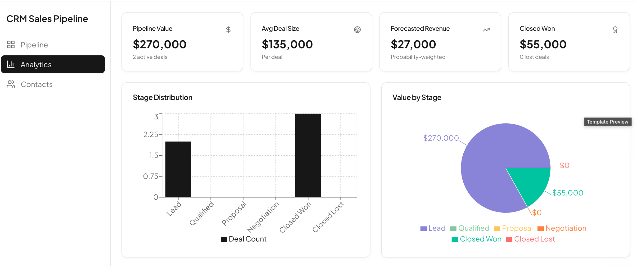
A sales pipeline dashboard shows revenue leaders where every deal stands and what the next 30, 60, and 90 days look like. Reps see their own pipeline, and managers see the teams at a glance.
Zite's CRM Sales Pipeline template, by the Zite team, gives you a focused pipeline view with built-in stage tracking and forecast metrics.
Key metrics to include:
- Pipeline value by stage and rep.
- Win rate by deal size and source.
- Average sales cycle length.
- Slipping deals (no activity in 14+ days).
- Forecast against the quarterly target.
Why it matters: A pipeline that looks healthy in week one of the quarter can hide stalled deals that will miss the number. Live tracking shows the drift in time to act.
Prompt to try in Zite: 'Build a sales pipeline dashboard tracking pipeline value by stage and rep, win rate by deal size and source, average sales cycle length, slipping deals, and forecast against quarterly target. Pull data from our HubSpot.'
4. Quote and invoice operations dashboard
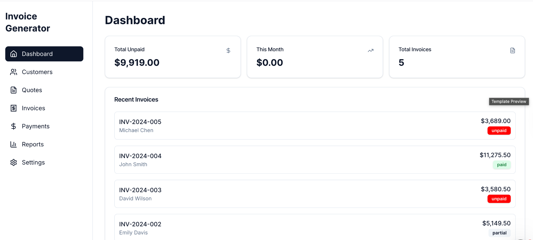
A quote and invoice operations dashboard tracks every quote sent, invoice generated, and payment received in one place. Finance and revenue ops use it to spot stuck quotes, overdue invoices, and bottlenecks in the cash collection cycle.
Zite's Quote & Invoice Generator template by Omation is a clone-and-customize starting point with quote drafting, invoice generation, and payment tracking already wired up.
Key metrics to include:
- Open quotes by age and stage.
- Outstanding invoices by customer and age.
- Average time from quote to payment.
- Total billed vs. collected this period.
- Disputed or partial payments flagged.
Why it matters: Slow invoicing and unfollowed quotes are the cheapest cash flow leaks to fix once you can see them. Daily visibility catches the drift before it hits the runway.
Prompt to try in Zite: 'Build a quote and invoice operations dashboard showing open quotes by age and stage, outstanding invoices by customer and age, average time from quote to payment, total billed vs. collected this period, and disputed payments. Pull data from our QuickBooks and CRM.'
5. Equipment rental operations dashboard
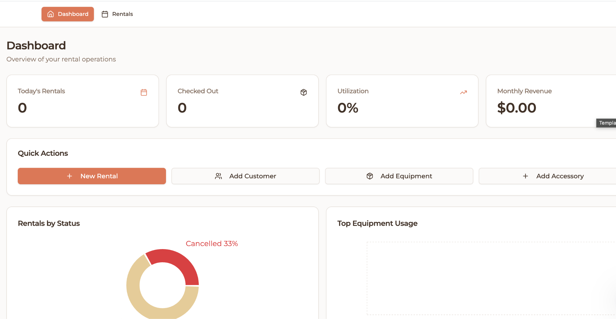
An equipment rental operations dashboard tracks the lifecycle of physical assets: what's checked out, what's available, what's overdue for return, and what needs service. Rental businesses, fleet managers, and field service teams use it to keep utilization high and downtime low.
Zite's Equipment Rental Tracker template by Automation Helpers gives you a working starting point with check-out, return, service, and revenue tracking already set up.
Key metrics to include:
- Current asset status (available, rented, in service).
- Utilization rate per asset and category.
- Overdue returns and outstanding deposits.
- Service schedule and last service date.
- Revenue per asset over the period.
Why it matters: Idle assets and late returns silently drain margin. A live dashboard surfaces both, so you can rebalance the fleet or chase the customer.
Prompt to try in Zite: 'Build an equipment rental operations dashboard tracking asset status, utilization rate per asset and category, overdue returns and outstanding deposits, service schedule and last service date, and revenue per asset. Pull data from our inventory spreadsheet and rental records.'
6. Bug tracking dashboard
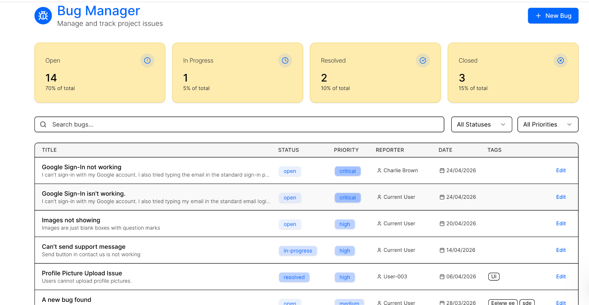
A bug tracking dashboard shows engineering and IT teams every open issue, its severity, and how long it's been pending. It's the live triage view that replaces the "what should I work on next" Slack scramble.
Zite's Bug Tracker template by the Zite team is a useful starting point if you want a working bug intake, prioritization, and resolution flow from day one.
Key metrics to include:
- Open bugs by severity and assignee.
- Mean time to detection and resolution.
- Bugs by source (customer report, internal QA, monitoring).
- Aging backlog (bugs older than 7, 30, 90 days).
- Recurring bug patterns by component.
The risk of skipping it: Outages and quality regressions cost customers and erode trust. Engineering needs to see degradation patterns the moment they start, not after the support inbox lights up.
Prompt to try in Zite: 'Build a bug tracking dashboard showing open bugs by severity and assignee, mean time to detection and resolution, bugs by source, aging backlog, and recurring patterns by component. Pull data from our GitHub and customer support tool.'
7. Payroll operations dashboard
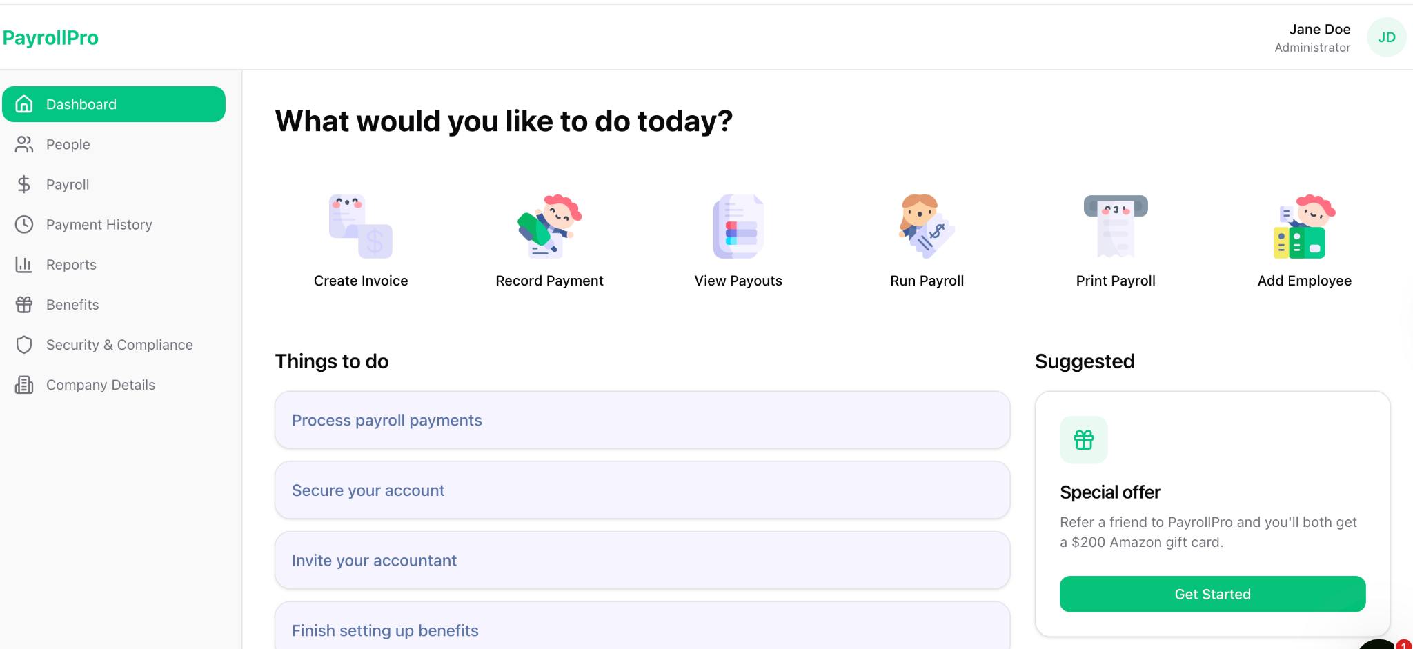
A payroll operations dashboard gives HR and finance teams a single view of every payroll cycle: who's paid, what's owed, where the variances are, and what compliance items are due. It catches errors before payroll hits the bank, not after.
Zite's Payroll Management App template by the Zite team gives you a ready-made starting point you can clone and customize for your own pay cycles and approvers.
Key metrics to include:
- Employees by pay status (processed, pending, on hold).
- Total payroll cost by department and period.
- Variance from the previous payroll cycle.
- Pending approvals and time-off adjustments.
- Compliance items due (tax filings, benefits enrollment).
Why it matters: A payroll error becomes a trust problem the moment a team member checks their bank app. A live dashboard catches the variance before approval, not after the deposit lands.
Prompt to try in Zite: 'Build a payroll operations dashboard tracking employees by pay status, total payroll cost by department and period, variance from previous cycle, pending approvals, and compliance items due. Pull data from our HRIS and payroll provider.'
8. Training operations dashboard

A training operations dashboard tracks how individual learners progress through training programs, certifications, and onboarding plans. L&D teams, sales enablement leads, and onboarding managers use it to see who's on track, who's stuck, and where the curriculum needs work.
Zite's Student Progress Tracker template, built by the Zite team, is designed to track progress against a curriculum, with module completion and assessment scores already wired up.
Key metrics to include:
- Learners by progress stage and program.
- Completion rate per module or course.
- Average time to completion.
- Assessment scores and pass rates.
- Coaching or follow-up tasks coming due.
The payoff: A training program is only as good as completion and retention data. The dashboard turns "are people actually learning this?" into a number leadership can act on.
Prompt to try in Zite: 'Build a training operations dashboard tracking learners by progress stage and program, completion rate per module, average time to completion, assessment scores, and coaching tasks coming due. Pull data from our LMS and HRIS.'
9. Donation tracking dashboard

A donation tracking dashboard gives fundraising and development teams a live view of every donor, gift, and campaign. Nonprofit operations leads use it to track campaign performance, donor lifetime value, and recurring gift retention without having to export reports.
Zite's Donation Tracker template by the Zite team gives you a clone-and-customize starting point with donor profiles, gift logs, and campaign tagging built in.
Key metrics to include:
- Total raised by the campaign and the time period.
- Donor count and average gift size.
- Recurring gift retention rate.
- Top donors and donor lifetime value.
- Pledge fulfillment and outstanding commitments.
Why it matters: Nonprofits operate on margins where every recurring donor who lapses is hard to replace. A dashboard surfaces the at-risk donors before the renewal date, not after.
Prompt to try in Zite: 'Build a donation tracking dashboard showing total raised by campaign and time period, donor count and average gift size, recurring gift retention rate, top donors and donor lifetime value, and pledge fulfillment. Pull data from our donor database and payment processor.'
5 tools to build your operations dashboard
You can build operations dashboards inside your existing ops software, use a dedicated dashboard product, or use a no-code app builder to create something custom. Here are five options worth considering.
- Zite is an AI-powered no-code app builder that quickly generates operational dashboards and other business apps from prompts. It's ideal when you need a dashboard built around your own data and metrics, not forced into a pre-built widget set.
- Geckoboard connects to dozens of operational data sources and displays them as live dashboards on a TV or wall monitor. A strong choice when the goal is to broadcast metrics to a team in a shared space.
- Klipfolio offers customizable analytics dashboards that pull from databases, spreadsheets, and SaaS tools. Works well for ops teams that need flexible reporting across multiple data sources.
- Smartsheet combines spreadsheet-style data tables with dashboard widgets, such as charts and metrics. Useful when your team already lives in spreadsheets and needs a more formal layer on top.
- Excel or Google Sheets with pivot tables and conditional formatting can serve as a starter dashboard for small teams. The most accessible option, but it caps out quickly as data volume and team size grow.
Build your operations dashboard with Zite
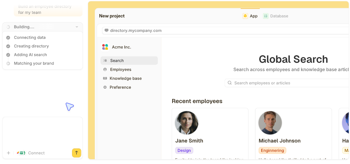
Zite builds custom operations dashboards from a single prompt. You describe your metrics, data sources, and team structure, and Zite generates the database, views, and app logic to make it real.
Here's how Zite helps:
- Generate the dashboard from a prompt: Describe your operations dashboard, and Zite builds the tables, charts, and views in minutes.
- Built-in database: Tables and fields live inside Zite, so there's no separate database to wire up or pay for.
- Visual app logic you can inspect: Every workflow Zite generates appears as a flowchart, so you can see exactly how alerts and status updates fire.
- Connect existing data: Native integrations with Airtable, Google Sheets, Slack, and more pull data wherever it lives.
- Role-based access: Decide who sees which dashboards and metrics before launch.
- Unlimited users on every plan: No per-seat pricing, so adding teammates doesn't increase your bill.
- Match your brand: Apply your organization's design system and publish the dashboard on your own domain.
Zite already has ready-made templates in the marketplace you can clone and customize, including an Inventory Manager, an Equipment Rental Tracker, a Bug Tracker, and several more.
Pricing starts free, with Pro at $19/month and Business at $69/month, both billed monthly.
Frequently Asked Questions
What is an operations dashboard template?
An operations dashboard template is a pre-built layout that displays the key metrics for a specific ops function, such as inventory, CRM, bug tracking, or payroll, with charts, KPIs, and filters already configured. You customize it with your own data sources and metrics rather than building from scratch.
What KPIs should an operations dashboard include?
The KPIs an operations dashboard should include depend on your function, but most ops dashboards track real-time volume metrics (orders, tickets, units produced), efficiency metrics (cycle time, utilization, on-time percentage), quality metrics (defect rate, error rate, customer satisfaction), and trend lines so the team sees direction in addition to the current number.
What's the best free operations dashboard template?
The best free operations dashboard template depends on your existing tools. Smartsheet and Google Sheets offer free templates that work for basic tracking. For something more custom, Zite's free plan lets you build a working operations dashboard from a prompt, with no template restrictions.
How do I customize an operations dashboard template to fit my workflow?
To customize an operations dashboard template to fit your workflow, start by mapping which metrics matter most for your team. Then adjust the template's fields, data sources, and visualizations to match. Most no-code tools, including Zite, let you make these changes by typing what you want rather than working through nested settings menus.
Can I build an operations dashboard without code?
Yes, you can build an operations dashboard without code using AI no-code tools like Zite. Describe what you want to track, and the tool generates the database, charts, and app logic for you, with no programming needed.