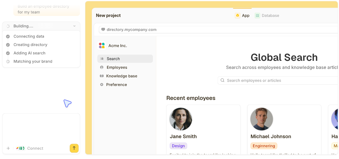


Logging into five different tools to piece together how your business is doing wastes hours every week. The right dashboard software for a small business brings it all into a single view. After testing more than 25 tools, these 13 stood out across reporting, KPI tracking, and operational data.
13 best dashboard software for small business: quick comparison
Pricing correct as of July 2026. All prices are billed monthly unless noted otherwise. Verify with the vendor.
How I researched and tested these dashboard software tools
I spent about 4 weeks across these 13 tools, building variations of the same small business dashboard in each to compare how they handled data connections, visualization, setup speed, and ongoing maintenance. The 13 below are the ones that earned a place.
I judged each tool on five things:
- Set up speed for non-technical users: How long does it take a small business owner (not a data analyst) to go from sign-up to a working dashboard?
- Data source connections: Whether the tool connects to QuickBooks, Shopify, Google Analytics, HubSpot, and Stripe without manual exports.
- Visualization quality: Whether charts, tables, and KPI tiles look presentable out of the box.
- Pricing for small teams: Whether the price fits a small business budget as you grow.
- Maintenance burden: Whether the dashboard keeps working as data changes, or turns upkeep into a job of its own.
1. Data Studio (formerly Looker Studio): best for Google-based reporting on a budget
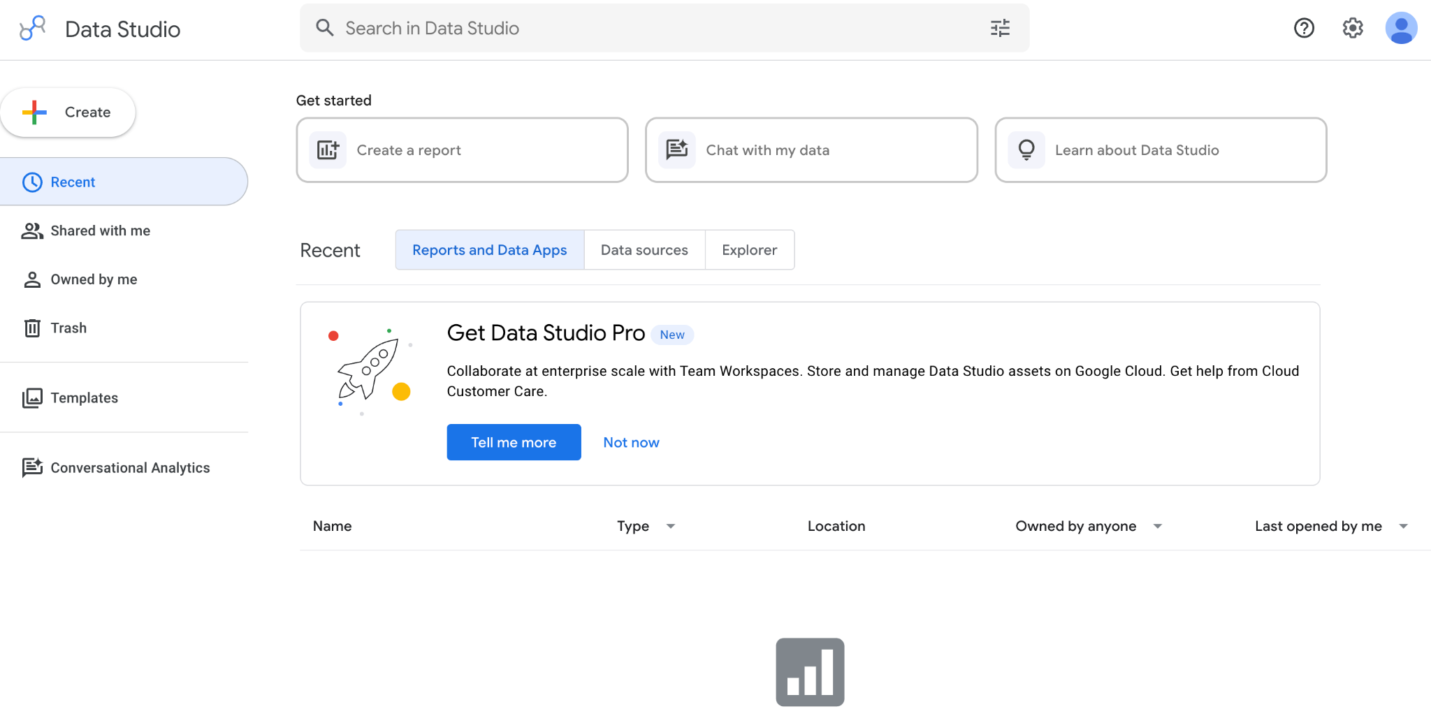
What it does: Data Studio is Google’s free data visualization tool with deep integrations with Google Analytics, Ads, Sheets, and BigQuery.
Best for: Small businesses, freelancers, and marketers who run on Google’s tools and want free, shareable dashboards with no per-user fees.
Data Studio is the free option that punches above its weight for small businesses. I built a marketing dashboard that pulls data from Google Analytics 4, Google Ads, and a Google Sheet in about 2 hours, then shared it with the team for $0. The catch is that anything outside the Google ecosystem requires third-party connectors, which often incur monthly fees.
Key features
- Free-for-all core features: No paid tier for the standard product.
- Native Google integrations: Google Analytics, Ads, Sheets, BigQuery, Search Console.
- 800+ community connectors: Connect non-Google sources via partner integrations (often paid).
- Data blending: Combine multiple data sources into a single chart.
Pros
- Free, including team sharing and unlimited reports.
- Deep, native Google ecosystem integration.
- Easy collaboration for teams already in Google Workspace.
Cons
- Non-Google connectors often require paid third-party integrations.
- Limited customization compared to dedicated BI tools.
- Reports can lag with large datasets.
What users say
“The most useful aspect is the integration with spreadsheets that work as data sources, the ease of dragging or selecting table columns, and the recent modification designed with a mobile‑first approach, which allows reports to adapt correctly on mobile devices.” Jaime Ricardo L, G2

“A few things could be better in Looker Studio. Performance can slow down with a larger dataset or complex dashboards, which affects the overall experience.” Raja B, G2
Pricing
Free for the standard product; Pro $9/user/month for extra team features. Non-Google connectors via third-party providers usually run $15 to $50/month each. See the Data Studio pricing site.
Bottom line
Data Studio is the obvious pick for small businesses that run on Google Analytics, Ads, and Sheets, and want free dashboards. If your data lives in non-Google tools, the connector cost adds up fast.
2. Zite: best for AI-built operational dashboards with a built-in database
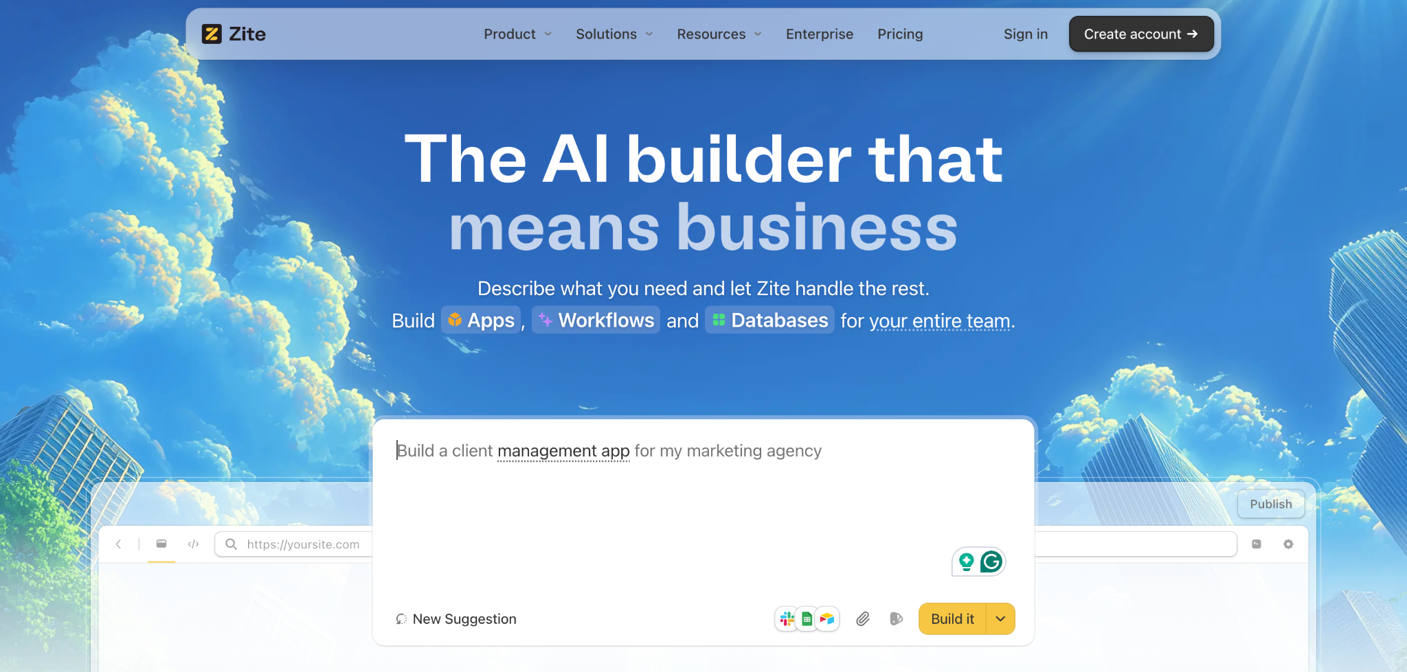
What it does: Zite is an AI-powered no-code app builder that generates operational dashboards (with the database, workflow logic, and role-based access) from a plain-language prompt.
Best for: Small business owners and ops teams who want a real dashboard tied to live data without choosing between a BI tool, a database tool, and an app builder.
I started with a prompt: “Build a dashboard that tracks weekly sales, inventory levels, and customer support tickets.” Zite generated the database tables, the layout with KPI tiles and charts, and an alert workflow (notify me when inventory drops below a threshold) in one pass.
The visual workflow editor showed me the alert logic as a flowchart I could trace and verify, not a config screen I had to trust. When something needs changing, I describe the change, and Zite updates the workflow.
It also connects to the tools my data already lived in. Airtable, Google Sheets, HubSpot, Stripe, and Slack are direct, pick-from-a-menu connections, and workflows can pull in data from most other services.
Key features
- AI dashboard generation: Describe what you want, and Zite generates the database, layout, and workflow logic all in one go.
- Direct data connections: Pull from the tools your data already lives in, Airtable, Google Sheets, HubSpot, Stripe, Slack, and more, with workflows reaching most other services.
- Visible database with tables and fields: Real tables, linked records, AI fields, and formulas you can edit without SQL.
- Visual workflows: Alerts and status changes appear as a flowchart you can read and check, so you always know what your dashboard is doing behind the scenes.
- Role-based access and unlimited users: Owners, managers, and staff each see the views relevant to them, with no per-seat creep as the team grows.
Pros
- One prompt produces the dashboard, the database, and the workflows together.
- A visible database means you can audit and edit data without leaving the builder.
- Unlimited users on every plan, including free, so the bill doesn’t grow with your team.
Cons
- Newer product, so the template marketplace is still growing.
- AI credits are limited on the free and lower tiers.
- Not a pure BI tool for SQL analysts or data-warehouse work.
What users say

“I made a whole website last night in about an hour, and the result is as good as anything I’ve ever had a web designer build for any of my companies that cost thousands of dollars.” Verified User, Reddit
“More flexibility on pricing tiers for teams with variable submission volumes would be welcome.” Alvaro H, G2
Pricing
Free (limited AI credits, unlimited users); Pro $19/month (100 credits/month, 100K records); Business $69/month (200 credits/month, 250K records). See Zite pricing.
Bottom line
Zite is the strongest pick for small businesses that want a real operational dashboard with the database and workflows that power it, in one tool. For pure BI reporting against a data warehouse, Metabase or Tableau is a better fit.
3. Databox: best for marketing and sales KPI tracking
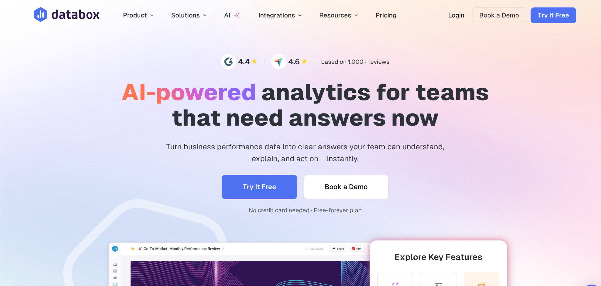
What it does: Databox is a KPI dashboard tool with 100+ prebuilt integrations for marketing, sales, finance, and ops.
Best for: Small marketing and sales teams who want fast KPI tracking from existing tools without building from scratch.
Databox shines at speed for KPI tracking. I connected HubSpot, Google Analytics, and Stripe in under 30 minutes and had a marketing dashboard running. The pre-built metric library matters when you don’t have a data analyst.
Key features
- 100+ pre-built integrations: Marketing (HubSpot, Google Ads, Meta), sales (Salesforce, Pipedrive), finance (Stripe, QuickBooks).
- Metric library: Pre-defined KPIs across categories so you don’t build them yourself.
- Goals and alerts: Set targets and get notified when metrics deviate.
Pros
- Fastest setup here for KPI tracking from marketing and sales tools.
- Mobile app is a working app, not a stripped-down web wrapper.
- Pre-defined metrics save hours of setup for non-technical teams.
Cons
- Limited customization beyond the pre-built integrations.
- Not built for operational dashboards or workflow logic.
- Higher tiers needed for unlimited users and forecasting.
What users say
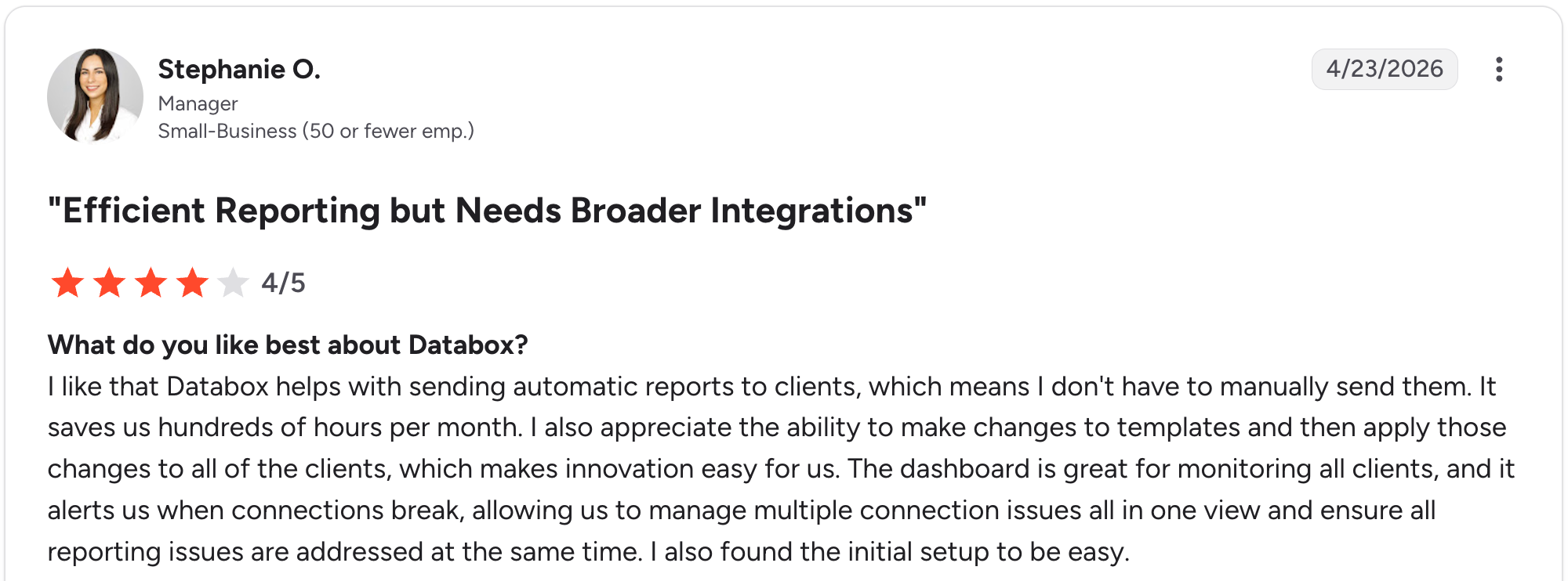
“I like that Databox helps with sending automatic reports to clients, which means I don't have to manually send them.” Stephanie O, G2

“While it has the major business integrations and connections, it needs more connections to work in certain industries.” Nancy S, G2
Pricing
Free (3 data sources, 1 user, 50 AI credits/month); Analyst $79/month (5 data sources); Pro $199/month (unlimited users, 1,500 AI credits); Growth $499/month (4,000 AI credits, forecasting). See Databox pricing.
Bottom line
Databox works best for small marketing and sales teams who want fast KPI tracking from existing tools. For custom or operational dashboards, look at Zite instead.
4. Geckoboard: best for shared-screen KPI visibility
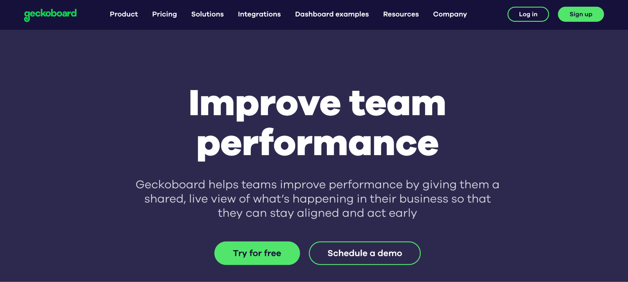
What it does: Geckoboard is a KPI dashboard tool built to display live metrics on TVs and shared screens.
Best for: Small teams who want an always-on dashboard the whole company can see (sales floors, support rooms, ops command centers).
Geckoboard’s niche is real-time visibility. I built a sales dashboard that updates every 30 seconds. While most tools assume individual viewing, Geckoboard is built for shared visibility, which changes how a small team rallies around its numbers.
Key features
- 90+ data integrations: HubSpot, Salesforce, Google Analytics, Stripe, Zendesk, custom APIs.
- TV-friendly displays: Auto-rotate dashboards, large, readable charts, no clutter.
- Slack integration: Send dashboard snapshots to Slack on schedule.
Pros
- Built specifically for shared-screen visibility, where most tools assume one viewer.
- Pre-built integrations cover common sales, marketing, and support tools.
- Simple to set up (most teams are live within an hour).
Cons
- Limited customization compared to general-purpose BI tools.
- Not built for deep analytics or ad-hoc querying.
- Higher entry price than most KPI tools on this list.
What users say
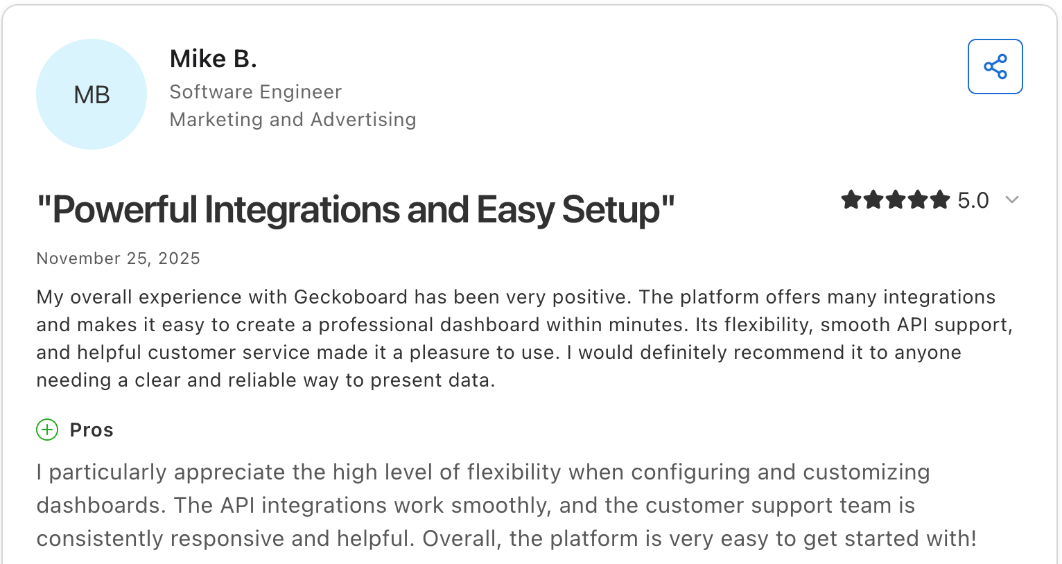
“I particularly appreciate the high level of flexibility when configuring and customizing dashboards.” Mike B, Capterra

“I wish there were more visualization options like pie charts or thermometer goal graphs. I also wish you could fit more data on one dashboard without it getting cut off.” Nicholas B, Capterra
Pricing
Essentials $149/month (live dashboards, all integrations); Performance $499/month (custom templates, real-time alerts, drilldowns); Enterprise custom. See Geckoboard pricing.
Bottom line
Geckoboard earns its place for small teams who want a shared, always-on KPI dashboard for the office or a Slack channel. For interactive or workflow-driven dashboards, Zite is a better fit.
5. Tableau: best for advanced visual analytics
What it does: Tableau is a leading analytics platform known for advanced visual exploration and highly interactive dashboards, now part of Salesforce.
Best for: Data-driven small businesses with more advanced analytical needs and the resources to support a per-user BI tool as they scale.
Tableau remains one of the strongest options for visual analytics and deep exploration. If your team values presentation-quality dashboards and interactive drill-downs, it is a compelling choice. For many very small businesses, though, it is more power (and more cost) than they need.
Key features
- Advanced visualizations: Interactive charts, maps, and dashboards with deep drill-down.
- Tableau Prep: Built-in data cleaning and preparation, bundled with Creator licenses.
- Broad data connectors: Databases, cloud warehouses, spreadsheets, and SaaS tools.
- Role-based licensing: Creator, Explorer, and Viewer tiers align costs with each user's role.
Pros
- Industry-leading visual analytics for complex data exploration.
- Large community, training resources, and template library.
- The viewer tier keeps view-only users relatively affordable.
Cons
- Per-user pricing climbs fast once you need multiple Creators.
- Steep learning curve for advanced features.
- Annual contract required; no true month-to-month at standard rates.
What users say
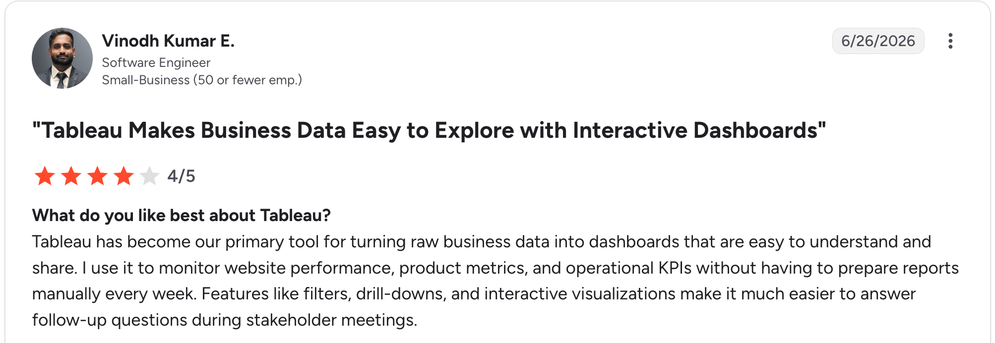
“Tableau has become our primary tool for turning raw business data into dashboards that are easy to understand and share.” Vinodh Kumar E, G2

“I find that dashboard version control and collaboration can be challenging compared to traditional software development workflows.” Nitin S, G2
Pricing
Viewer $15/user/month; Explorer $42/user/month; Creator $75/user/month (Standard edition, billed annually). Every deployment needs at least one Creator. See Tableau pricing.
Bottom line
Tableau works for data-driven small businesses with advanced analytical needs and the budget for per-user BI. For simpler KPI tracking, Databox or Data Studio costs far less.
6. Klipfolio: best for custom client dashboards
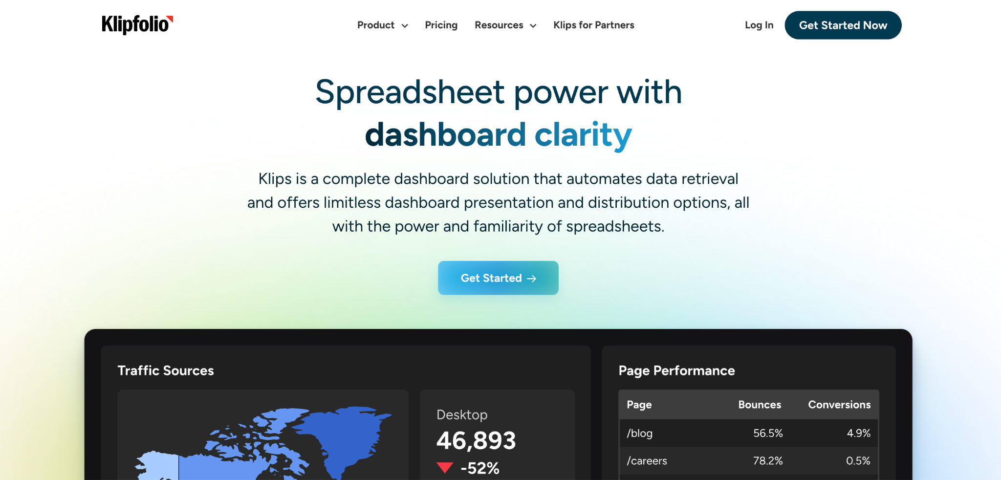
What it does: Klipfolio is a dashboard tool with formula-level control over how metrics are calculated and displayed, popular with agencies building branded client dashboards.
Best for: Small agencies and consultants who need customizable, branded dashboards for multiple clients with deep control over metric calculations.
Klipfolio’s strength is formula-level flexibility. Where most tools give you pre-built charts, Klipfolio lets you build custom metrics with spreadsheet-style formulas. The flexibility is real, but the dashboard limits and add-on pricing push the effective cost higher than the entry tier suggests.
Key features
- Formula-level metric control: Build custom KPIs with spreadsheet-style formulas.
- 130+ data connectors: Google Analytics, HubSpot, Salesforce, Xero, SQL databases.
- Unlimited users on every tier: No per-seat fees.
- White-label add-on: Custom branding, domain, and theme for agencies.
Pros
- Deepest formula-level control on this list for custom metrics.
- Unlimited users at every tier.
- Strong fit for agencies building branded client dashboards.
Cons
- Dashboard limits per tier push you to add-ons or higher plans fast.
- Add-ons (white-label, real-time refresh) stack up quickly.
- No row-level security at any tier, a constraint for multi-client setups.
What users say

“Seeing all of the pertinent data at a glance is really helpful.” Martin S, G2

“It doesn't have as many chart options as Power BI or Data Studio.” Verified User, G2
Pricing
Base $140/month (3 dashboards, unlimited users); Grow $220/month (10 dashboards, 1-hour refresh); Team $350/month (20 dashboards, 15-minute refresh); Team+ $690/month (40 dashboards, up-to-the-minute refresh). See Klipfolio pricing.
Bottom line
Klipfolio is well-suited to small agencies that need formula-level control over branded client dashboards. For straightforward KPI tracking, Databox is simpler and often cheaper once Klipfolio’s add-ons stack up.
7. Power BI: best for Microsoft-centric small teams
What it does: Power BI is Microsoft’s business intelligence tool with deep integrations into Microsoft 365, Excel, Teams, and Azure.
Best for: Small businesses standardized on Microsoft 365 (especially Excel-heavy teams) who want governed BI with native Teams and Excel integration.
Power BI is the value pick for Microsoft-centric small teams. The Desktop version is free, and the Excel integration is unmatched if you live in spreadsheets. The catch: real Power BI work requires learning DAX and Power Query, neither of which is no-code in practice.
Key features
- 250+ data connectors: Excel, Salesforce, Google Analytics, Azure, SQL Server.
- DAX formula language: Custom calculations and KPIs (steep learning curve).
- Microsoft 365 integration: Embed in Teams, publish to SharePoint, connect to Excel.
- Row-level security: Restrict which users see which rows.
Pros
- The deepest data connector library on this list.
- Native Microsoft 365 integration (Excel, Teams, SharePoint).
- Included with Microsoft 365 E5 at no extra cost.
Cons
- Steep learning curve. DAX and Power Query are not no-code in practice.
- Every viewer needs a Pro license ($14/user/month) on lower tiers.
- Pricing increased in 2025; budget for $14 Pro, not the legacy $10.
What users say
“Can easily connect to data sources like lists, SQL servers, as well as Excel /CSV stored in SharePoint, then build semantic models which can also be further used to build reports using a wide variety of prebuilt charts.” Ashutha K, G2

“The data load time for large datasets is pretty long.” Swati J, G2
Pricing
Desktop free; Pro $14/user/month; Premium Per User $24/user/month; Microsoft Fabric F2 capacity starting around $263/month (capacity-based, varies by region). See Power BI pricing and Microsoft Fabric pricing.
Bottom line
Power BI makes sense for small businesses standardized on Microsoft 365, with someone willing to learn DAX. For non-technical owners or non-Microsoft shops, Zite or Data Studio will be faster to launch.
8. Metabase: best for SQL-friendly teams on a budget
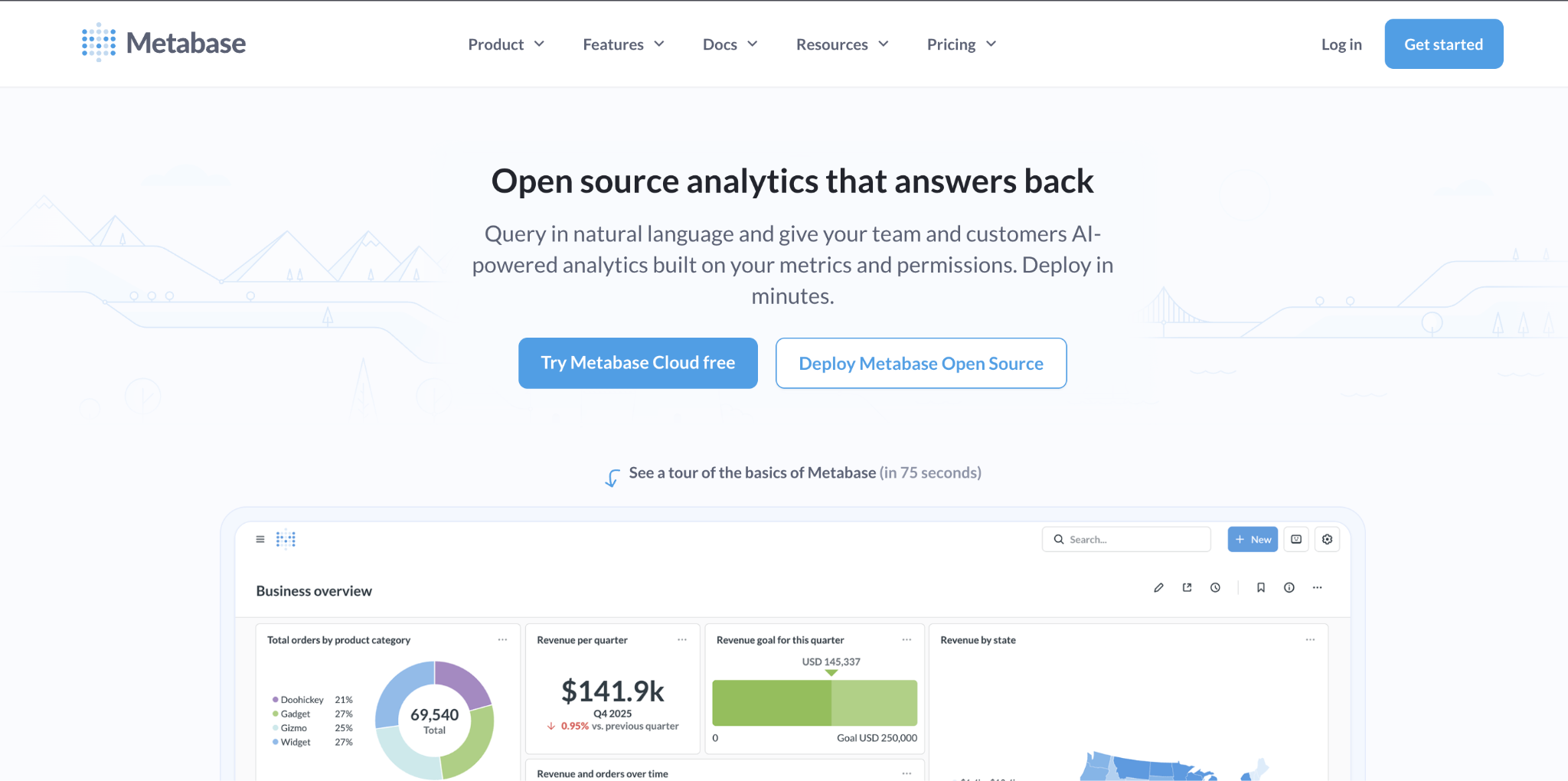
What it does: Metabase is an open-source business intelligence tool with a SQL editor, a visual query builder, and dashboards for teams that query databases directly.
Best for: Small businesses with a technical person who can self-host the free version, or who want real BI features (SQL, joins) without enterprise pricing.
Metabase is the strongest open-source BI option for budget-conscious small businesses with technical capacity. The visual query builder keeps it accessible, while the SQL editor gives a technical team room to go deeper. The free self-hosted option is capable if you can run it.
Key features
- Visual query builder and SQL editor: Non-technical users build visually; technical users use SQL.
- Open-source self-hosting: Free to deploy on your own infrastructure.
- 20+ database connectors: PostgreSQL, MySQL, BigQuery, Redshift, and more.
- Scheduled alerts: Email or Slack notifications when metrics cross thresholds.
Pros
- Free open-source option for technical teams who can self-host.
- Real BI features (SQL, joins) that lightweight tools lack.
- The visual query builder keeps it accessible to non-analysts.
Cons
- Self-hosting means real infrastructure costs, plus someone technical to keep it running.
- Per-user pricing on cloud Pro counts every viewer.
- Jumping from Starter ($100/month) to Pro ($575/month) is steep.
What users say
“This service is user-friendly for beginners. When I started my career, I used Metabase in the early days, and it didn’t take much time to understand the functionality.” Saurabh B, G2

“A few more visualizations and the output of specific query results in text boxes are only possible through workarounds.” Tobias S, G2
Pricing
Open Source free self-hosted; Starter (Cloud) $100/month ($6/user per month, first 5 included); Pro $575/month ($12/user per month, first 10 included, SSO, embedded); Enterprise from $20,000/year. See Metabase pricing.
Bottom line
Metabase is for small businesses with a technical person who can self-host or who wants real SQL-based BI on a budget. For non-technical owners, Zite or Data Studio is a better fit.
9. Softr: best for Airtable-based small teams
What it does: Softr turns Airtable, Google Sheets, or its own database into dashboards, internal tools, and client portals.
Best for: Small teams who already use Airtable and want a polished dashboard on top without rebuilding the data layer.
Softr’s strength is the polish of its templates and the depth of its Airtable integration. I built a sales dashboard connected to an Airtable base in about 90 minutes. See how Zite compares to Airtable for the app-building side.
Key features
- Multiple data sources: Airtable, Google Sheets, SQL databases, Softr’s own database.
- Pre-built dashboard blocks: Charts, tables, KPI tiles, and member areas.
- AI Co-Builder: Generates dashboard pages and the database from a description.
- User authentication and roles: Built-in login and role-based access.
Pros
- Most polished dashboard templates on this list for existing Airtable data.
- Strong template library for sales, ops, and marketing.
- Good fit for agencies serving multiple clients.
Cons
- Outgrows quickly for dashboards with workflow logic beyond viewing.
- Per-tier user and app limits push teams to higher plans.
- Reliant on Airtable’s record limits for larger datasets.
What users say
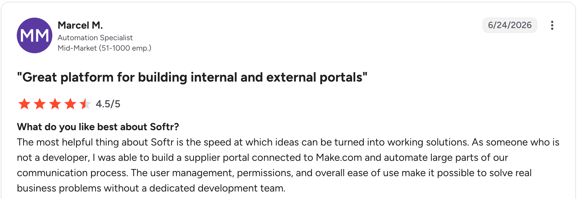
"The most helpful thing about Softr is the speed at which ideas can be turned into working solutions." Marcel M, G2

"The main challenge we encountered was with data management when using Google Sheets as our initial data source - it became clunky for our content team to update and manage at scale." Mike H, G2
Pricing
Free (1 app, 5 AI credits/month); Basic $59/month; Professional $167/month; Business $323/month. See Softr pricing.
Bottom line
Softr is the right call for small teams already using Airtable who want a polished dashboard layer on top of it. If your dashboard needs to drive workflows beyond viewing, Zite handles that in one tool.
10. Glide: best for mobile-friendly small-team dashboards
What it does: Glide turns Google Sheets, Excel, and Airtable data into mobile-friendly dashboards and apps with a drag-and-drop interface.
Best for: Small teams who want a lightweight dashboard that looks good on mobile, especially when data already lives in a spreadsheet.
Glide is the fastest tool here for turning a spreadsheet into a working mobile dashboard. I built a mobile-friendly sales dashboard in under an hour using a Google Sheet. See more on Glide pricing and how it scales.
Key features
- Spreadsheet-to-app workflow: Connect a Sheet, Excel file, or Airtable base, and Glide builds a dashboard shell automatically.
- Glide Tables: Native database for teams without a spreadsheet.
- AI features: Image recognition, text generation, document processing.
Pros
- Fastest tool here for spreadsheet-to-mobile dashboards.
- Clean mobile-friendly designs out of the box.
- Generous personal-user allowance on the Explorer plan.
Cons
- Work email logins require the Business tier ($249/month minimum).
- Update-based billing adds overage charges for heavy data sync.
- Limited chart and visualization options compared to dedicated BI tools.
What users say
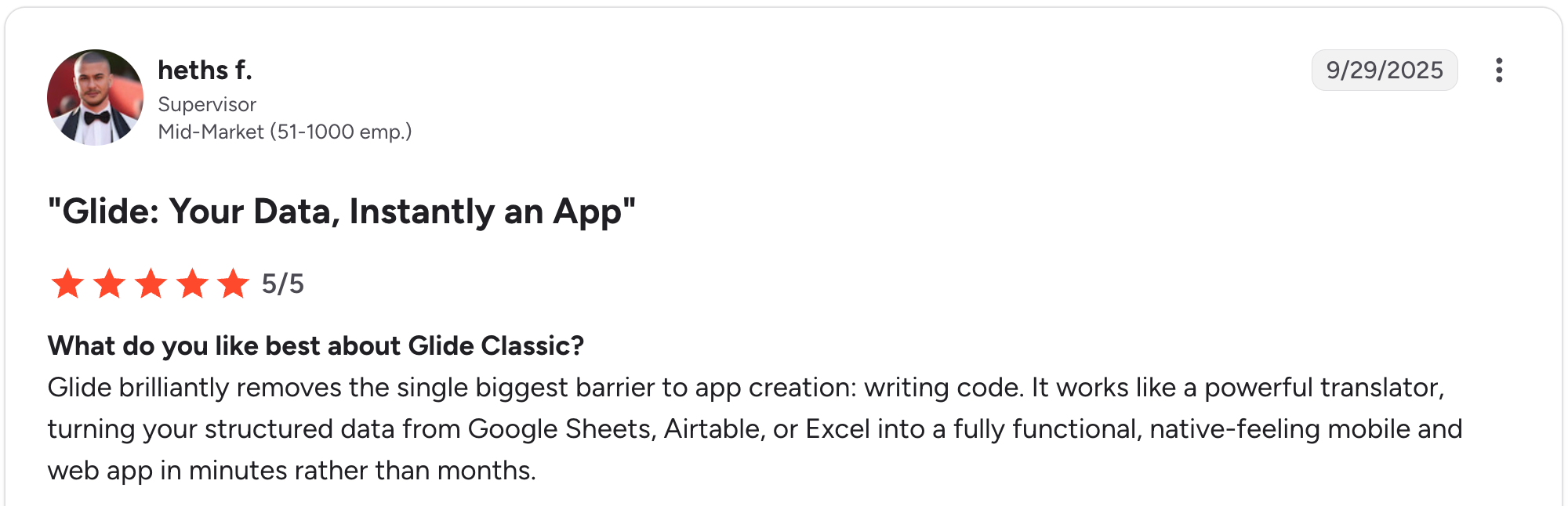
“Glide brilliantly removes the single biggest barrier to app creation: writing code.” Heths F, G2

“The fixed structure of apps and the different components are quickly limiting the designs of apps.” Christian B, G2
Pricing
Free (drafts only); Explorer $25/month (1 app, 100 personal users); Maker $60/month (3 apps, unlimited personal users); Business $249/month (30 users + $6/additional). See Glide pricing.
Bottom line
Glide suits small teams that need a mobile-friendly dashboard for fewer than 30 users. If your audience might scale to hundreds, per-user pricing adds up fast.
11. Notion: best for lightweight team tracking
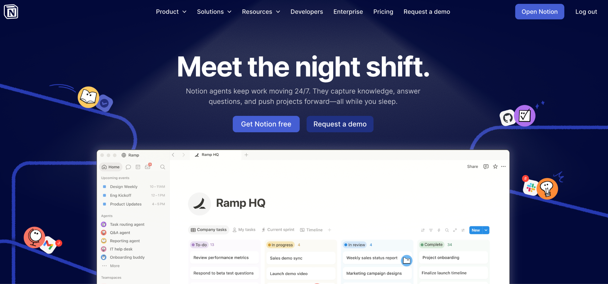
What it does: Notion lets you create databases for projects, customers, and metrics, then layer on tables, boards, and rollups to act as a team dashboard inside your existing workspace.
Best for: Small teams already in Notion who want lightweight tracking alongside their docs, tasks, and notes.
Notion isn’t a dedicated dashboard tool, but so many small teams use it that way that it earns a spot. I built a quarterly goals dashboard with rollups from three linked databases. For visualization-heavy dashboards, dedicated tools are a better fit.
Key features
- Linked databases with rollups: Pull metrics from multiple databases into one view.
- Multiple views: Table, board, calendar, gallery, or timeline.
- Templates: Hundreds of community dashboard templates.
Pros
- No new tool to learn if your team already uses Notion.
- Docs, tasks, and dashboards in one workspace.
- Predictable per-member pricing.
Cons
- Charting options are limited compared to dedicated tools.
- Performance slows on databases with thousands of rows.
- Per-member pricing scales with the number of team members.
What users say

“The fact that you can customize the tables and pages.” Louise P, G2

“What I like the least is that, although it is very flexible, that same flexibility can make it somewhat chaotic at first if you don't have a clear structure from the start.” Júlia B, G2
Pricing
Free (personal use); Plus $12/member/month; Business $24/member/month (SSO, advanced security); Enterprise custom. See Notion pricing.
Bottom line
Notion is the natural fit for small teams already in Notion who want lightweight tracking alongside their docs. For visualization-heavy or client-facing dashboards, look elsewhere.
12. Domo: best for unifying many data sources on one platform
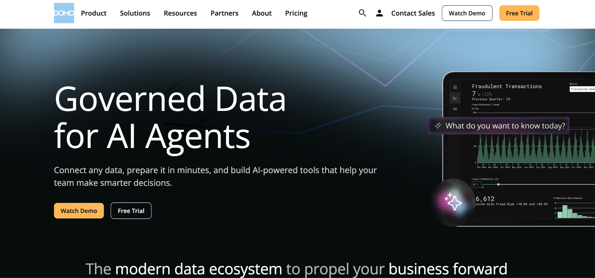
What it does: Domo is a cloud-based business intelligence platform that centralizes data from multiple sources into a single environment for visualization, reporting, and mobile access.
Best for: Growing businesses that want an all-in-one platform to unify many data sources and are ready for an enterprise-level investment.
Domo combines data integration, ETL, dashboards, and mobile reporting into a single product. The connector library and mobile-first design are real strengths. The trade-off is cost: Domo sits at the enterprise end of this list, well above most small-business budgets.
Key features
- 1,000+ data connectors: One of the broadest connector libraries available.
- Built-in ETL (Magic ETL): Clean and combine data without a separate tool.
- Mobile-first dashboards: Strong app for executives and field teams.
- Unlimited users: Credit-based model shares a pool rather than charging per seat.
Pros
- Broad connector library covering most business systems.
- Mobile experience is among the best in the category.
- Intuitive dashboard builder accessible to non-technical users.
Cons
- No published pricing; every contract requires a sales conversation.
- A credit-based consumption model makes costs hard to predict.
- A floor price of around $30,000/year puts it out of reach for many small teams.
What users say
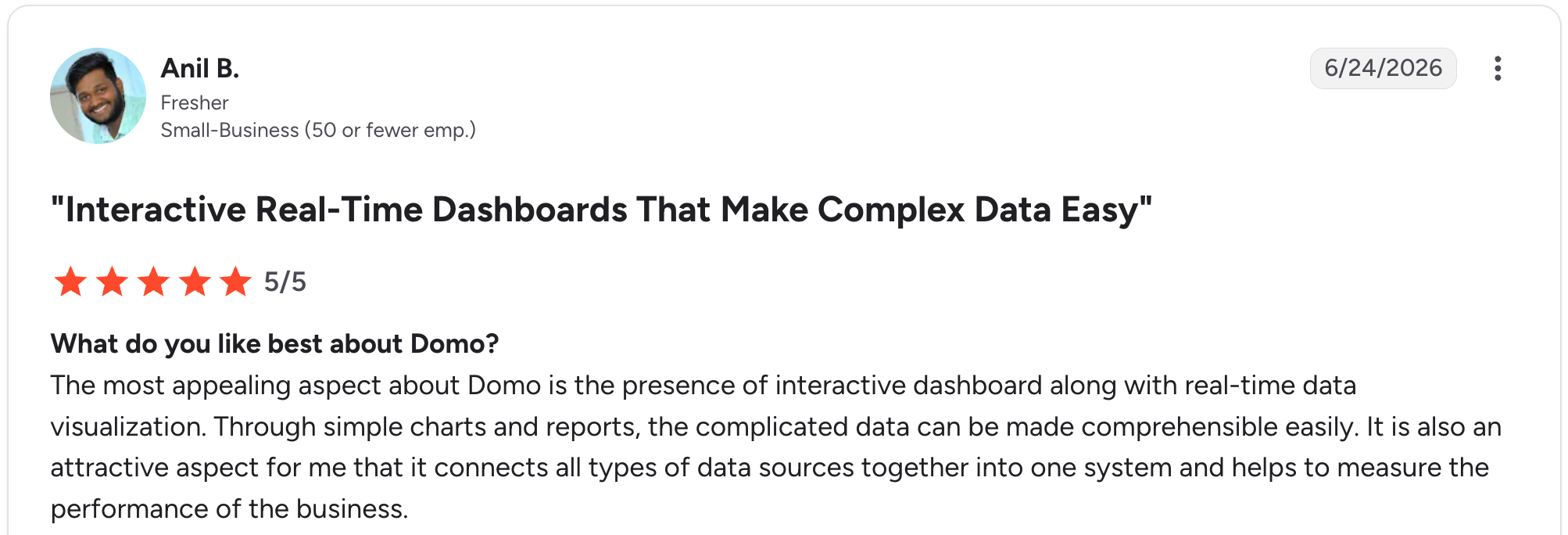
“The most appealing aspect about Domo is the presence of an interactive dashboard along with real-time data visualization.” Anil B, G2

“One downside of Domo is its relatively high cost compared to other BI tools, which can be a concern for smaller teams.” Anuj T, G2
Pricing
No public pricing. A 30-day free trial is available, then a credit-based consumption plan is negotiated with sales. Third-party data puts the floor around $30,000/year, with a median near $60,000/year. See Domo pricing.
Bottom line
Domo is built for growing businesses ready to unify many data sources on one platform and budget for an enterprise tool. For most small businesses, the cost is hard to justify; Databox or Data Studio deliver KPI tracking for a fraction of the price.
13. Bubble: best for custom dashboard applications
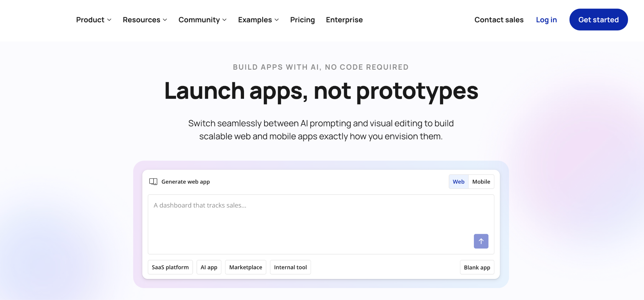
What it does: Bubble is a visual programming tool for building fully custom web apps without code, including dashboards with complex workflow logic.
Best for: Small businesses or founders building a custom dashboard that needs deep customization, custom workflows, and pixel-level design control.
Bubble is the most powerful tool on this list, but the power comes with a learning curve. I rebuilt the same dashboard in about 5 hours. Once you’re past the curve, you can build dashboards that rival custom-coded products.
Key features
- Visual editor for full web apps: Frontend, backend, database, and workflows in one tool.
- Built-in database: Tables, fields, and relationships.
- Plugin ecosystem: Thousands of community plugins.
Pros
- Powerful enough to build fully custom dashboards.
- The built-in database and workflows handle the real business logic.
- The plugin marketplace covers most integration needs.
Cons
- Steep learning curve. Many small businesses hire a Bubble developer.
- Workload Unit pricing means costs can spike as usage increases.
- No code export, so you’re locked into Bubble for hosting.
What users say

“Strong community & resources: templates, tutorials, forums, plugin marketplace help you accelerate development.” Murugappan V, G2

“Basic features like chat stream seem like a challenge for Bubble's team to have an official plugin for.” Nouman J, G2
Pricing
Free (testing only); Web and Mobile Starter $69/month, Growth $249/month, Team $649/month. Web-only plans start lower at $32/month. See Bubble pricing.
Bottom line
Bubble works for small businesses, enabling the creation of fully custom dashboards with deep logic. For most small business dashboards, the learning curve isn’t worth it; Zite or Databox will be faster to launch.
Which dashboard software should your small business choose?
The right pick depends on where your data lives, how technical your team is, and your budget.
Choose Data Studio if you:
- Run on Google Analytics, Ads, and Sheets.
- Want free dashboards with no per-user fees.
Choose Zite if you:
- Want AI to build the dashboard, database, and workflows together.
- Need a visible database you can edit without code.
- Want unlimited users without per-seat pricing.
Choose Databox if you:
- Track marketing and sales KPIs from common tools.
- Want fast setup with pre-defined metrics.
Choose Geckoboard if you:
- Want a shared, always-on KPI dashboard for office TVs or Slack.
- Need a real-time refresh for a sales floor or support team.
Choose Tableau if you:
- Need advanced visual analytics and deep data exploration.
- Have the budget for per-user BI as your team grows.
Choose Klipfolio if you:
- Are a small agency building branded client dashboards.
- Need formula-level control over metrics.
Choose Power BI if you:
- Are standardized on Microsoft 365 (especially Excel).
- Have someone willing to learn DAX.
Choose Metabase if you:
- Have a technical person who can self-host the free version.
- Want real SQL-based BI on a budget.
Choose Softr if you:
- Already use Airtable and want a polished dashboard on top of it.
- Need user authentication for client-facing dashboards.
Choose Glide if you:
- Need a mobile-friendly dashboard from spreadsheet data.
- Have a small user base (under 30 work email users).
Choose Notion if you:
- Already use Notion and want lightweight tracking.
- Don’t need advanced visualizations.
Choose Domo if you:
- Want an all-in-one platform to unify many data sources.
- Are ready for an enterprise-level investment.
Choose Bubble if you:
- Are building a fully custom dashboard with deep logic.
- Have time to learn a powerful tool.
For more on dashboard use cases, see Zite’s guide to custom dashboard software.
Final verdict
For most small businesses, the best dashboard software depends on where your data lives. If you run on Google tools and want free, Data Studio wins. For an AI-built operational dashboard tied to a visible database and workflows, Zite is the strongest pick, with unlimited users at $19/month.
For marketing and sales KPI tracking, Databox. For advanced visual analytics, Tableau. For Microsoft shops, Power BI. For shared-screen visibility, Geckoboard. Match the tool to your data sources and your budget, not to the longest feature list.
Start building with Zite to get your small business dashboard live today.
Frequently asked questions
What is the best dashboard software for a small business?
The best dashboard software for a small business depends on where your data lives. For free Google-based reporting, Data Studio leads. For AI-built operational dashboards with a visible database, Zite is the strongest pick at $19/month with unlimited users.
How much does dashboard software cost for a small business?
Dashboard software for small businesses ranges from free (Data Studio, open-source Metabase) to enterprise contracts costing tens of thousands per year (Domo). Most small-business options fall in the $14 to $140/month range for starter tiers.
What is the best free dashboard software for a small business?
The best free dashboard software for small businesses is Data Studio if you run on Google data, since it’s fully free with no per-user fees. Zite, Softr, Glide, and Notion all have free tiers, and Metabase is free if you can self-host.
Do I need technical skills to build a small business dashboard?
No, most dashboard software for small businesses is built for non-technical users. Tools like Zite, Databox, Geckoboard, and Data Studio let owners build dashboards with prompts, templates, or drag-and-drop. Metabase and Power BI expect SQL or DAX for advanced features.
What data can a small business dashboard connect to?
A small business dashboard can connect to the tools you already use: accounting (QuickBooks, Xero), e-commerce (Shopify), marketing (Google Analytics, HubSpot), payments (Stripe), and CRMs. Check that your specific tools are supported before committing, as some connectors incur an extra fee.
How long does it take to set up a small business dashboard?
Setting up a small business dashboard takes under an hour to a few days, depending on the tool. KPI tools with pre-built integrations (Databox, Geckoboard) connect in minutes. AI builders like Zite generate a working dashboard from a prompt in an afternoon.
Can a small business dashboard update in real time?
Yes, most dashboard software for small businesses supports live or near-real-time updates. Geckoboard refreshes every 10 to 30 seconds, Zite and Softr update as the underlying database changes, and Data Studio refreshes Google data on a schedule you set.