Brand assets and guidelines
The marks, colours and type that make Zite look like Zite. Use them as they come — every asset on this page is the current system.
Download assetsLogo
The full logo leads; the icon covers the spaces it cannot fit. Keep them monochrome on busy ground, give them clear space equal to half the icon's height, and never redraw, stretch or recolour them. Each comes as an SVG and a transparent PNG.


Colour
Yellow leads and blue supports; black and chalk carry the type and the grounds, on a porcelain page. Click a swatch to copy its hex.
Typography
Three faces, each with one job. Headings are serif, everything else on the site is sans, and the product speaks Inter — so a mock reads as the product, not an illustration of it.
Means business.
Run your operations on one system.
Pipeline dashboard · 128 records
Iconography
Every glyph comes from the Central Icon System, on a 24px grid with 2px strokes. Drawn small, scale the stroke so it lands on whole pixels: 1.5 at 16px, 1.75 at 14px.
Graphics
Our graphics show the product itself, built from its real interface rather than exported as screenshots. Product shots sit framed on the brand pattern; animated scenes show the product at work.
Pattern
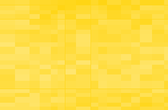
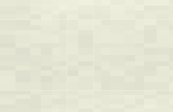
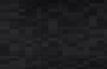
The field behind every asset: a lattice of spreadsheet cells, fading in and out on their own rhythm, in the brand's colourways — on the site, in blog posts and across our marketing. Download a ready-made one, or generate your own and export it as a PNG or an SVG.

Partner badges
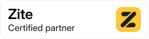
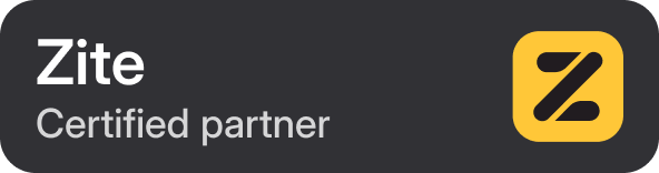
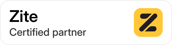
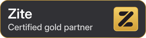
For Zite partners to show their certification on their own site and materials. Use the badge for your tier as it comes, at a size where its text stays readable.



Social media assets
Header images for our social channels, sized to each platform and exported at 2x. Use them as they are: the headline sits clear of where each platform crops or overlays its avatar.
YouTube banner
2048 × 1152
X banner
1500 × 500
LinkedIn banner
1128 × 191