

Overview
Good design in Zite starts with a system, not a collection of one-off tweaks. Choose the overall style first, then refine individual sections once the app has a consistent foundation.Start with the whole design
New builders often start by fixing the first thing that looks wrong: one button, one card, one heading, one color. That can work for small issues, but it can also make the app feel patched together. Before editing individual components, decide the app’s design direction:
Design systems work because the same decisions repeat: the same font scale, button style, color roles, card treatment, spacing rhythm, and navigation patterns. In Zite, global theme and Brand Kit changes are the fastest way to create that consistency.
Use Brand Kit or themes for global style
Use global design controls when the change should apply across the app. This keeps the app easier to maintain and prevents each page from drifting into a different visual style. Use a Brand Kit when you want Zite to reuse a brand across multiple apps. Brand Kits can include logos, icons, fonts, color palettes, button styles, card styles, and written guidelines.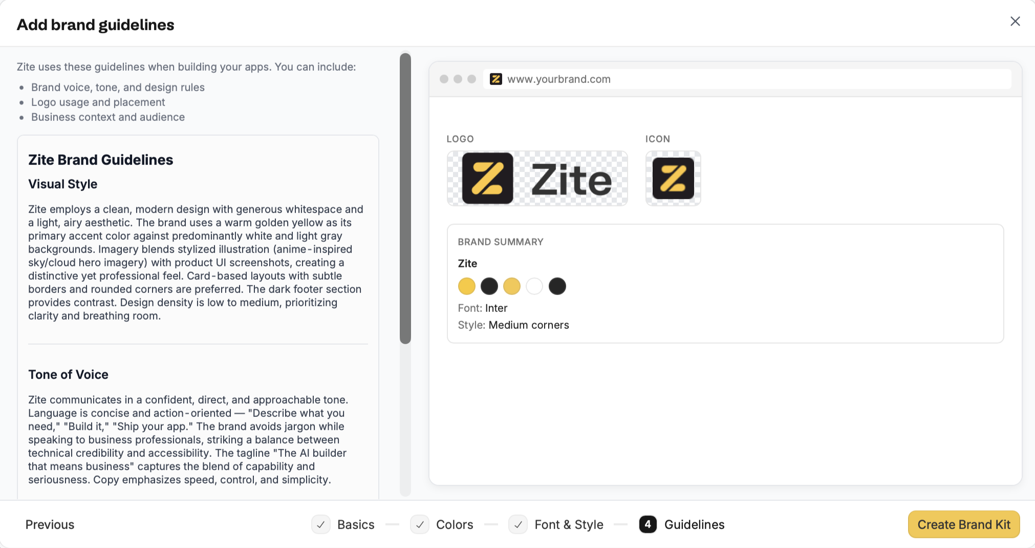
swatch icon, then choose the theme or Brand Kit you want to apply.
Global changes are best for:
- Main fonts and type scale
- Primary, secondary, accent, background, and text colors
- Button shape, color, and weight
- Card, panel, and table styling
- Overall spacing and density
- Light or dark visual direction
- Navigation and page-level layout patterns
Applying a theme from the design panel does not use credits. AI-powered design work, such as changing a design from an uploaded photo, does use credits.
Set fonts and colors
Fonts and colors should usually be configured in your theme or Brand Kit first. That keeps headings, body text, buttons, backgrounds, cards, and links consistent across the app. Use individual edits when a specific section needs a local adjustment, such as making one heading larger, changing a single button color, or improving contrast in one card. Avoid changing the same font or color one component at a time if the decision should apply everywhere.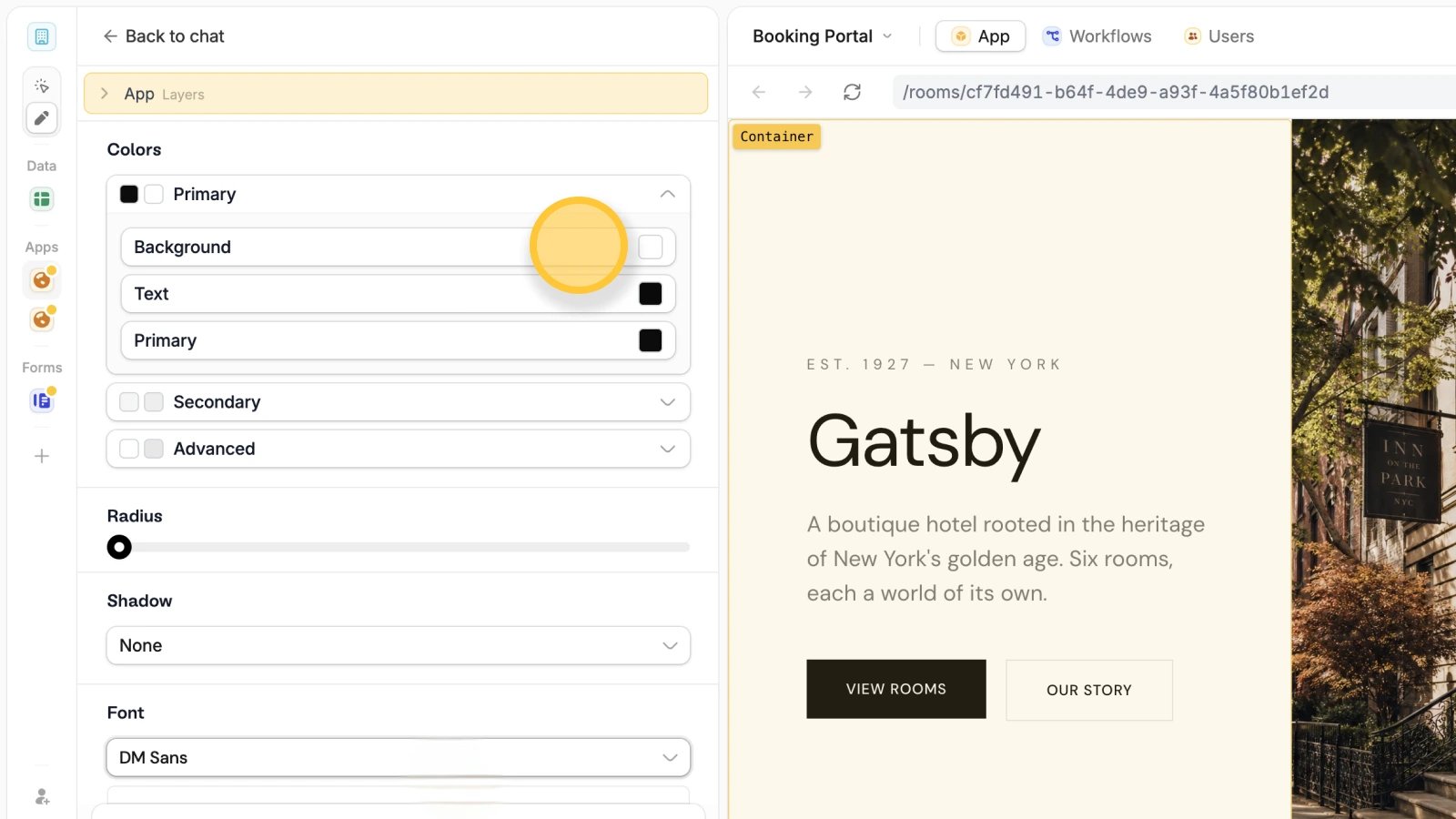
- Background sets the surface behind content
- Text controls readability
- Primary should be reserved for the main action or strongest brand accent
- Secondary and advanced colors can support less important actions, cards, and details
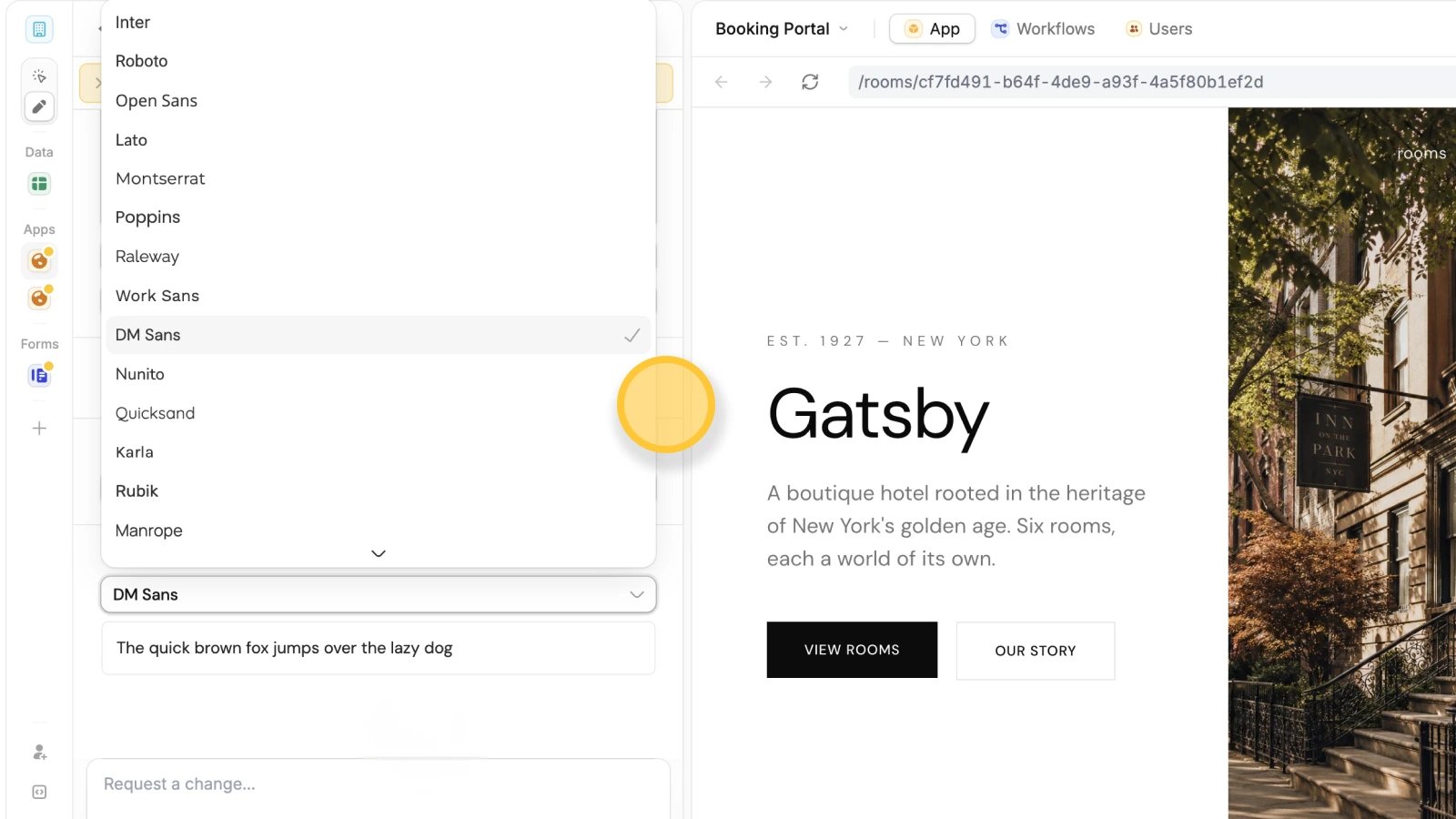
Custom fonts
The app uses Google Fonts. If your reference photo includes a different font, it’ll automatically use the closest available match from the Google Fonts library. You can’t upload font files directly to Zite. However, if your font is hosted online through a public URL (such as Google Fonts, Adobe Fonts, or another web font provider), you can use it by importing it with@font-face in the CSS file.
Give Zite better references
You can guide Zite with a website link, screenshot, mockup, uploaded image, or written brand rules. The reference is more useful when you say what Zite should learn from it. Good reference prompts are specific:- “Use the colors and typography only.”
- “Match the card style, but keep the current layout.”
- “Use the spacing and visual hierarchy, but keep our brand colors.”
- “Use this as a mobile layout reference, not a desktop reference.”
Create images with AI
You can ask Zite to create images for your app, including placeholder visuals, hero images, empty states, thumbnails, illustrations, and marketing sections. AI-generated images work best when the image supports the page but does not need to be exact. Use them for early design direction, campaign concepts, example content, or polished visuals when you do not have final assets yet.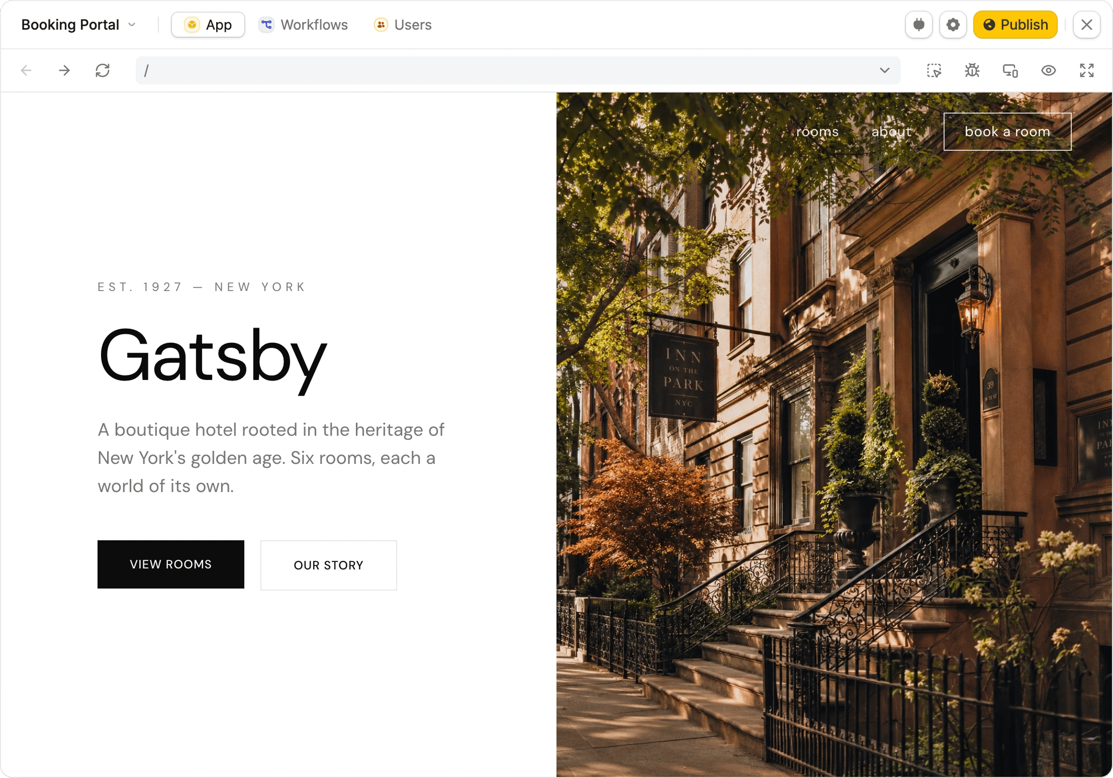
Improve the current app
If the app works but needs a systematic quality pass, open Improve my app from the+ menu. You can run an automated Review, Design, or Accessibility agent without writing a prompt.
Use Review agent for common behavior and implementation issues, Design agent for visual and UX polish, or Accessibility agent for WCAG 2.1 AA checks. See Improve my app for the complete workflow.
Use Selective Edits for small changes
Use Selective Edits when the design direction is right but one part needs adjustment. It is the best tool for precise changes that should not affect the rest of the app.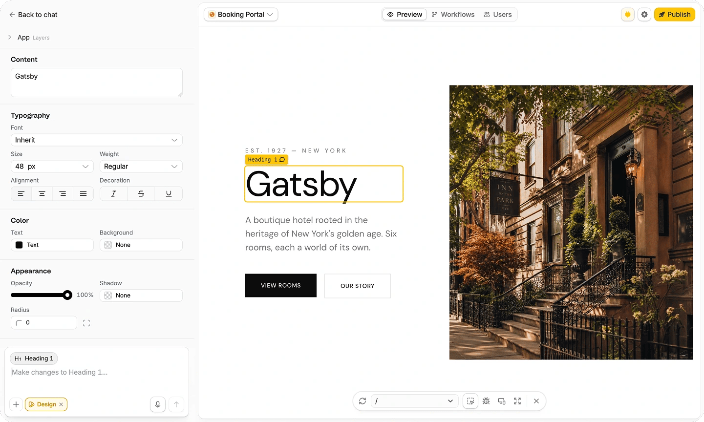
- Rewriting a heading, label, or button
- Changing one component’s color, padding, alignment, or radius
- Moving or deleting a section
- Adjusting a card, table, image, or form field
- Fixing a local spacing issue
- Fine-tuning a component after a global theme change
Check responsive behavior
A good app should not just shrink from desktop to mobile. The layout should adapt so people can still read, tap, scan, and complete the main task at every screen size. UseResponsive mode to inspect smaller widths, and use Fullscreen when you want to review the app without the builder UI around it.
- Navigation remains easy to find and use
- Text wraps without overlapping other elements
- Buttons and links are large enough to tap
- Tables, cards, and filters still make sense on mobile
- Modals and dropdowns fit inside the viewport
- Important actions are not hidden below long content
- Images crop or resize without hiding key information
- Forms can be completed without horizontal scrolling
Keep the design readable
Visual style should support the user’s task. A polished app is not just more decorative; it is easier to understand. Use this checklist when reviewing your design:
When something feels off, describe the problem in terms of the user’s task:
A practical design workflow
1
Choose the system
Start with a Brand Kit, theme, template, website link, or screenshot. Decide what should be global before changing individual components.
2
Build the core app
Create the main pages, data views, forms, workflows, and navigation before doing detailed visual polish.
3
Apply global styling
Use the theme panel or Brand Kit for fonts, colors, buttons, cards, and overall density.
4
Review in preview
Check the app in normal preview,
Responsive mode, and Fullscreen. Look for hierarchy, readability, spacing, and mobile issues.5
Use Improve my app
Choose
Review for general quality checks or Designer for visual polish after the app is working.6
Make focused final edits
Use Selective Edits for small adjustments and focused prompts for page-specific issues. Avoid broad redesign prompts once the app is close.