

Choose the right tool
Manual design edits don’t use AI credits. Asking AI to redesign a section, generate an image, or make a change uses credits.
Use Design mode
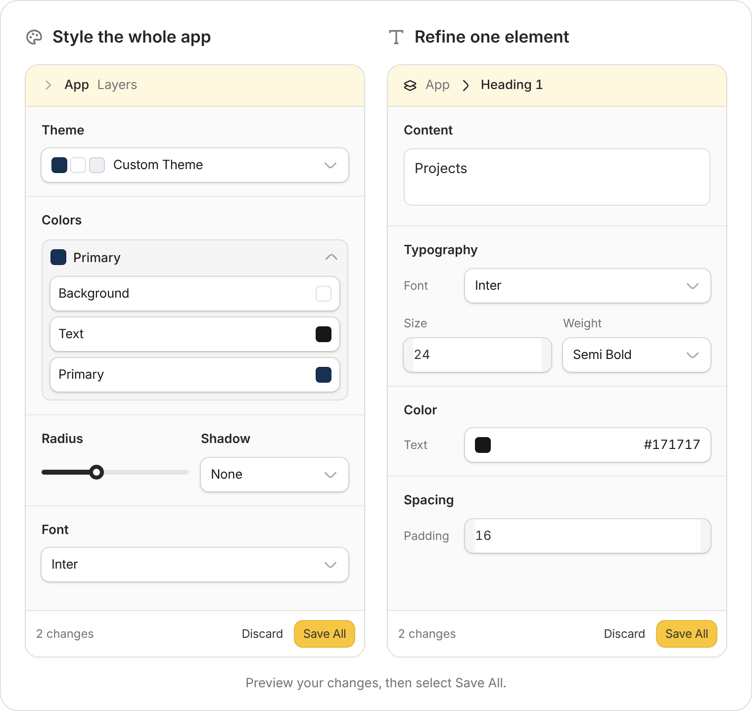
App-wide theme controls and individual element controls, shown with example values.
1
Open Design mode
Select Design mode below the chat box, or Edit in the preview toolbar.
2
Choose what to style
- The whole app: Select App in Layers. Under Theme, choose a theme or Brand Kit, then adjust Colors, Radius (corner rounding), Shadow, and Font.
- One element: Select it in the preview or expand Layers to find it. Use the available content, typography, color, appearance, and spacing controls.
3
Save and check
Changes appear in the preview first. Select Save All to keep them, or Discard to remove your unsaved edits.Wait for saving to finish, then try the affected page. Select Publish when you’re ready to update the version people use.
Give Zite better references
For a bigger change, attach a screenshot through + → Upload file, or paste a website link. Say what to match and what to keep.Use the attached screenshot as a style reference for our client portal. Match its spacing and card style. Keep our brand colors, navigation, and existing data.
- Company assets: Use a Brand Kit for your logo, fonts, and colors.
- Images: Upload your own assets, or ask Zite to generate an illustration for a specific part of the app.
- A broader review: Use Improve my app to review design and accessibility.
Check responsive behavior
Open Screen size and fullscreen in the preview toolbar. Try Mobile as well as Desktop, or use Fullscreen for a larger preview.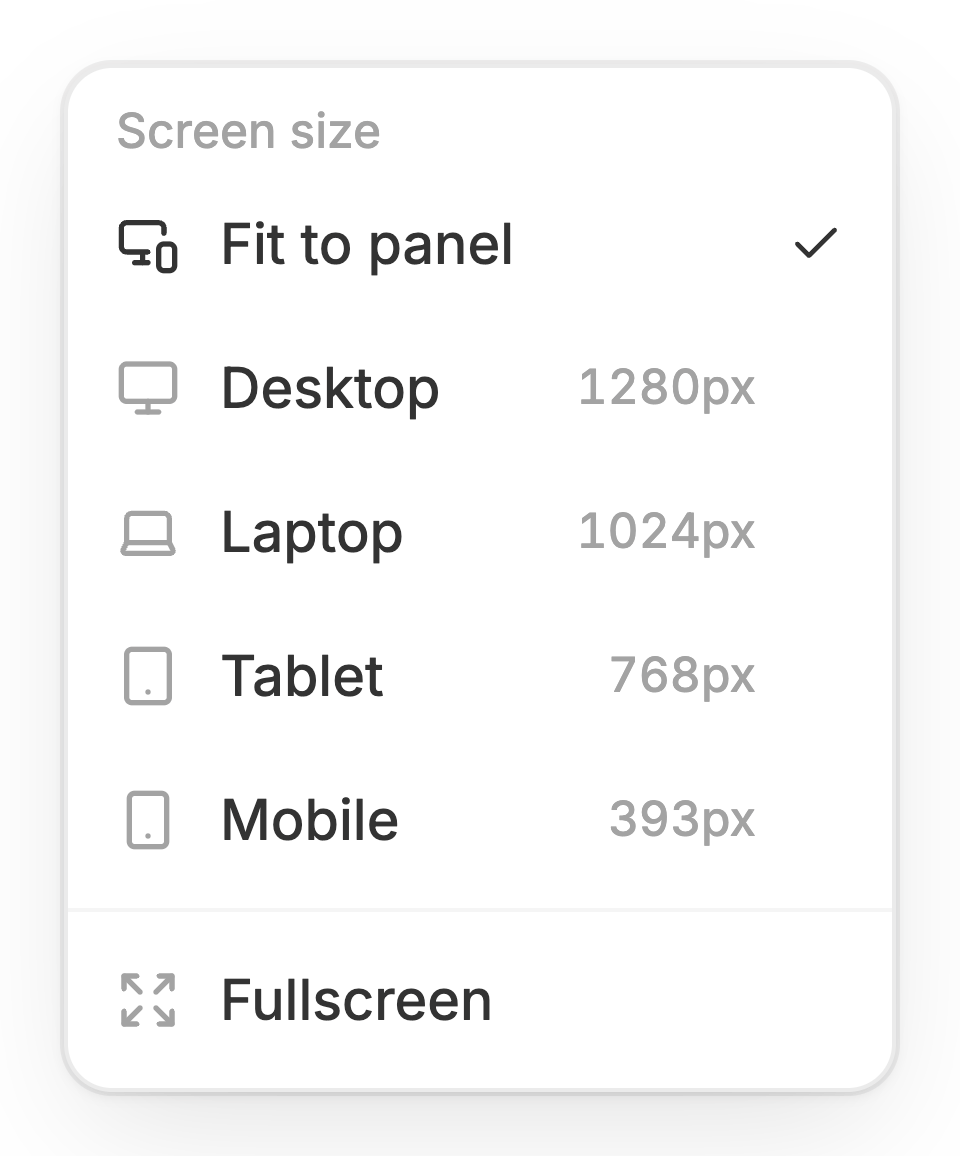
Check that people can complete the main tasks on smaller screens.
- Readability: Text has enough contrast; long names and labels fit.
- Navigation: Menus, buttons, and filters are easy to find and tap.
- Real tasks: Forms, tables, and dialogs work on a small screen.
On mobile, make the Jobs filters easier to use and stop job names being cut off. Keep the desktop layout and existing data.